April 26, 2024

Economix: The Shrinking Ranks of the Working

Just when you thought it might be safe for the Fed to begin to think about taking its foot off the accelerator, along comes a jobs report that makes the employment picture look much less rosy than we had thought.

FLOYD NORRIS

FLOYD NORRIS

Notions on high and low finance.

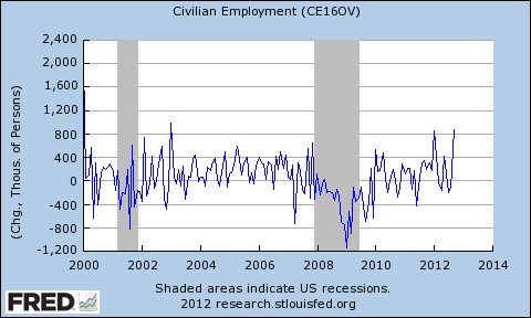
The most distressing part of the report came from the household survey. It found that 206,000 fewer people were working in March than during the previous month. That would make it the worst month in more than a year. (The more widely followed establishment survey found employment rose by a disappointing 88,000.)

The household survey also found the labor force participation rate – the proportion of people at least 16 years of age who were working or looking for work – fell to 63.3 percent, the lowest rate since 1979.

That fuels the narrative that the unemployment rate is coming down not because the economy is getting better, but because people are giving up looking for jobs. It raises the specter that the Washington follies are having a more serious impact than we had thought. Raising taxes on the least well-off working people – through the payroll tax increase that took effect at the beginning of the year – might have been a poor idea.

There are reasons to hope those fears are misplaced. The first is that the household survey is notoriously volatile. It covers 60,000 households, and the numbers can bounce around from month to month as different households are surveyed. (To minimize that, households stay in the survey for more than one month, but there are always changes.)

Over time, as the baby boom generation gets older, there is going to be some decline in the labor force participation rate as retired people represent a greater proportion of the group being counted. (You are treated the same whether you are 16 or 116.)

But month-to-month changes are not influenced much by that. Particularly notable in the latest report is that the participation rate for men 45 to 54 fell to 85.3 percent in March. That is only a dip of 0.1 percentage point from February, but it is the lowest level since the figure was first recorded in 1948. It is also two percentage points below the lowest figure during the recent recession.

The idea that a lot of men in their prime working years are becoming discouraged and giving up looking for work would be profoundly troubling. Let’s hope next month will produce evidence that what we have here stems more from sampling errors than from reality.

Article source: http://economix.blogs.nytimes.com/2013/04/05/the-shrinking-ranks-of-the-working/?partner=rss&emc=rss

Economix Blog: The Shrinking Government

FLOYD NORRIS

FLOYD NORRIS

Notions on high and low finance.

For the 31st consecutive month, the number of government jobs in February was less than it had been a year earlier. There is an employment recovery, but it is confined to the private sector.

The only comparable period in government data, which goes back to 1939, came after World War II, when the government was shrinking for a very good reason. The year-over-year string of declines ended in December 1947 at 30 months. So we have a new record here — a record being set largely because governments, particularly local ones, have been squeezed by a dearth of tax revenues. Year-over-year jobs have been down for 44 consecutive months in local governments.

For the most recent 12 months, private sector employment is up 1.9 percent. Government employment is down 0.5 percent.

As I noted last month in an Off the Charts column, men have done better in the recovery than women have done. That column was based on the government’s household survey, which asks people if they have jobs. The establishment survey, which asks employers both how many workers they have and how many of them are women, helps to explain why that is.

Women dominate in government jobs, now holding 57 percent of them, and have been losing them at a slightly more rapid pace than men have lost their government jobs. The decline in teacher employment probably explains much of that.

Another area where women dominate is in financial services. Not at the top, of course, but down in the trenches. Over all, women hold 57.8 percent of financial service jobs. But as financial service employment has recovered over the last two years, 71 percent of the added jobs have gone to men. As a result, the share of such jobs held by women is now the lowest since 1983.

The really good news in the report provides another sign of recovery in the single area — other than government — that has been holding back this economic recovery. Construction employment was up by 48,000 jobs in February. The last month construction added that many building jobs was March 2007. A month later, Countrywide Financial said its chief executive, Angelo Mozilo, had been paid $48 million in 2006, but that problems in the subprime market had reduced profits.

“Management anticipates that both subprime products and investments will return to profitability in subsequent quarters absent a material worsening of market conditions,” Countrywide said. Only now are we recovering from the very material worsening that did arrive.

The employment numbers are seasonally adjusted, of course, and winter seasonal adjustments can be misleading. If the February gain were standing alone, there would be reason to doubt the figure. But this is no one-month wonder. Over the last six months, construction employment is up 154,000. We haven’t seen that large an increase since 2006.

Article source: http://economix.blogs.nytimes.com/2013/03/08/the-shrinking-government/?partner=rss&emc=rss

Economix Blog: The Recovery Spreads

FLOYD NORRIS

FLOYD NORRIS

Notions on high and low finance.

A year ago, the jobs recovery outlook was gray. From October 2010 to October 2011, the economy added 1.2 million jobs, according to the non-seasonally adjusted figures from the household survey. All of the net gain, and a little more, was in the over-55 age category.

There were also gains among the youngest workers, 16 to 24 years old. But the number of people with jobs in the prime working years — 25 to 54 — actually fell, by 683,000.

Over all, more than two-thirds of the added jobs went to people over 60. It should be no surprise that there was a lot of doubt about whether there really was a recovery.

Over the last 12 months, the story has been different. First, the recovery has accelerated. There were 3.1 million more jobs shown in the household survey released Friday than in the October 2011 survey, and one million of them were in the prime-age category. Workers over the age of 60 still got one-third of them, but two-thirds went to younger workers.

People get older every year, of course, and the size of each population group changes as people who were 59, for example, turn 60 and move into a different bracket. You can control for that by looking at the employment-to-population ratio for each bracket. Compared with a year ago, it is up for every five-year bracket under 65, but level for the brackets above that age.

Article source: http://economix.blogs.nytimes.com/2012/11/02/the-recovery-spreads/?partner=rss&emc=rss

Economix: How Bureau of Labor Statistics Tames Volatile Raw Data for Jobs Reports

7:32 p.m. | Updated

CATHERINE RAMPELL

CATHERINE RAMPELL

Dollars to doughnuts.

The unemployment rate fell to 7.8 percent in September, its lowest level since President Obama took office. With just a month to go before the election, the news seemed too good to be true, at least for some Mitt Romney supporters.

Almost immediately some conservative pundits began accusing the Labor Department, which released the jobs numbers on Friday, of cooking the books. After all, the household survey — the survey that the unemployment rate comes from — showed that the number of people with jobs rose 873,000 in September, though the gain had averaged 164,000 each month earlier this year.

These numbers are always tremendously volatile, but the reasons are statistical, not political. The numbers come from a tiny survey with a margin of error of 400,000. Every month there are wild swings, and no one takes them at face value. The swings usually attract less attention, though, because the political stakes are usually lower.

Look how noisy these numbers are, and always have been! Look how noisy these numbers are, and always have been!

The numbers, by the way, are especially imprecise (and prone to revision) when the economy is making a turn, or when regular seasonal patterns start to change. And there is reason to believe that one particular seasonal pattern — the start of the college school year — may be partly responsible for the big swing in September.

One of the biggest sources of volatility in the last couple of months (and one of the major contributors to the big bump in job-getters in September) was the group of workers between 20 and 24 years old.

Historically, the employment levels for that group have dropped sharply in September, probably because many people in their early 20s are leaving summer jobs and going back to school.

For each year since 1948, the average level of employment for this group has fallen by 398,000 from August to September. In fact, before this year, employment for this age group had risen just two times in that period: 1954 (a gain of 5,000), and 1961 (a gain of 22,000).

This year was the third time on record that the number of people in this age group gained jobs in September, and the gain was big: 101,000.

Source: Bureau of Labor Statistics. Numbers are not adjusted for seasonality. Source: Bureau of Labor Statistics. Numbers are not adjusted for seasonality.

How to explain this major deviation from the historical trend, other than conspiracy theories?

If you look back at August, an unusually high share of this age group stopped working, compared with past employment patterns in August. From 1948 to 2011, the number of those 20 to 24 who had jobs fell by an average of 98,000 from July to August. This past August, it fell by 530,000, the biggest loss on record.

Over the last couple of decades, in fact, the job losses for this age group have been growing each August, suggesting that over time young people have been leaving their summer jobs earlier and earlier.

Source: Bureau of Labor Statistics. Numbers are not adjusted for seasonality. Source: Bureau of Labor Statistics. Numbers are not adjusted for seasonality.

In other words, seasonal patterns might be evolving — people starting school and leaving their summer jobs earlier in the summer — which has big implications for how the Labor Department digests and reports the monthly employment data.

The Bureau of Labor Statistics adjusts its raw survey data to correct for seasonal patterns, and since a decline in employment is expected for those 20 to 24, the economists at the bureau increased the level of employment for this group in the seasonally adjusted numbers.

Changes in seasonal patterns like this one can introduce more error into the headline numbers, and can at least partly explain why the overall change in household employment looked so much bigger in September than seems plausible. After seasonal adjustment, the increase in employment among those 20 to 24 was given as 368,000. That’s about 42 percent of the overall increase in employment growth for people of all ages. (After making seasonal adjustments on the August figures, the employment level for 20- to 24-year-olds was reported as declining by 250,000.)

All of which is to say the bureau aims to release the most informative numbers it can. But it is seeking to measure the state of the American job market quickly, based on surveys that are inherently incomplete — and the adjustments that are meant to fill in the gaps have their own shortcomings, particularly when seasonal trends change.

In case you still believe that the models the bureau uses are being manipulated to put President Obama in a better light, note that there are no political appointees currently serving in the Bureau of Labor Statistics. The employees are all career civil servants who have worked under both Republican and Democratic administrations. (The commissioner of the bureau is supposed to be a political appointee, but that position is vacant. The acting commissioner, John M. Galvin, has held the position since January, and he is a career civil servant.)

Economists at the Bureau of Labor Statistics regularly adjust the models they use to account for factors like seasonality and the number of new companies entering the economy, and the revisions are often very large.

Economists outside the bureau have been weighing in, too, both on how the latest numbers should be adjusted and what the next few months of jobs reports should look like. A paper presented last month as part of the Brookings Papers on Economic Activity series, for example, incorporated data on people flowing into and out of unemployment to forecast that the unemployment rate would most likely stagnate for a few months to come.

Article source: http://economix.blogs.nytimes.com/2012/10/05/explaining-the-big-gain-in-job-getters/?partner=rss&emc=rss

Economix: Correcting the Picture on Jobs

11:29 a.m. | Updated This is one of those months when it’s impossible to tell a consistent story about the jobs report.

Job growth was unexpectedly strong last month. The unemployment rate rose to 9 percent, from 8.8 percent, its biggest one-month increase in more than a year-and-a-half.

Which of the two numbers should you believe? The short answer is the job-growth number. The labor market appears to be improving. The rise in the unemployment rate is mostly a reflection that the rate fell by an artificially large amount over the previous several months.

It doesn’t actually mean unemployment rose last month. Instead, it reflects a kind of statistical catch-up. The old picture of the job market, as presented by the household survey, had been too optimistic. (Did anyone really believe that the job market recently improved at its most rapid two-month pace since the 1950s, as the unemployment rate suggested?) Today’s report helps correct the picture. This is simply the nature of surveys: they have noise in them.

With all this being said, the rise in the jobless rate is not irrelevant. Before today, you could have argued that the employer survey was vastly underestimating the pace of job creation — in other words, the job market was healthier than the employer survey suggested even if it wasn’t quite as healthy as the household survey suggested. After today, it’s much harder to make that case.

The job market continues to improve, which is certainly welcome news. But the pace of improvement remains modest. Unfortunately, that’s the typical pattern in the wake of a financial crisis.

Update: Some readers have asked whether the unemployment rate can rise even as employment is growing because more people start looking for work — and thus count as officially unemployed. Theoretically, the answer is yes. This does happen sometimes. But it didn’t happen in April. The unemployment rate rose last month because the household survey showed a decline of 190,000 jobs, not because of a surge in job seekers. That’s why there is no way to reconcile last month’s results of the household survey and employer survey. They make sense only in the context of previous months.

Article source: http://feeds.nytimes.com/click.phdo?i=adf14f006bfd286a9af4d8086a142dc8