March 29, 2024

Bucks: The Only Investing Pattern That Matters Is Behavioral

Carl Richards is a certified financial planner in Park City, Utah, and is the director of investor education at The BAM Alliance. His book, “The Behavior Gap,” was published this year. His sketches are archived on the Bucks blog.

A few weeks ago, I stumbled on some research by David J. Leinweber at Caltech. Apparently,  he’s figured out how to predict the stock market using just three variables:

1) Butter production in the United States and Bangladesh
2) Sheep populations in the United States and Bangladesh
3) Cheese production in the United States

Statistically speaking, those three variables predicted 99 percent of the stock market’s movement. Imagine what you’ll be able to do with that information.

There’s only one problem. The joke is on us.

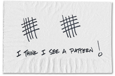
In our very human pursuit of looking for patterns, we start seeing things that aren’t really there. And as Dr. Leinweber highlighted in his study, we will mine the data until we see what we think is a pattern. We think if something happened a certain way in the past, then surely it will continue into the future. We start to believe, we want to believe, that this pattern will have predictive value.

Consider what’s going on in the stock market. The bubble watchers are convinced that they’ve identified a pattern from the past that tells us something about the future. And they even have charts and numbers to back up their pattern.

One of my current favorites compares the Nasdaq in 1999 and 2000 to the Standard Poor’s 500 Index in 2013. When you overlay the charts, they match perfectly. Imagine that. So, of course, we must be headed to an 80 percent decline. If you look a little closer, however, you’ll see the scales aren’t quite right. But it makes a fantastic visual if you’re looking for a pattern.

Then there’s the S.P. 500 itself.  It is up 16.9 percent year-to-date. That’s the fastest start for the S.P. 500 since 1987, when it rose 18.7 percent during the same time period. But later that year, we had Black Monday, when the Dow dropped more than 22 percent in one day. So we should be looking for the same thing to happen in 2013, right?

In fact the S.P. 500 is full of patterns if you’re looking for them. Pick your poison: sheep, the S.P. 500, gross domestic product, or the latest unemployment numbers. If you look for some sort of theme to emerge, it’s highly likely you will see something. But the past is not prologue.

While some of these silly data mining tricks might be interesting to talk about, they won’t help you. Every time someone approaches me with research — and it’s always called research — that shows a pattern in the data, the pattern eventually goes away. These things always work perfectly, until they don’t.

Oddly enough, the only pattern that will influence your investing success is your behavior. Can you break the pattern of buying high and selling low? Can you break the pattern of chasing after the next “big” investment? And perhaps most importantly, can you buy low-cost investments in a diversified portfolio, and then ignore it?

Now that’s a pattern I can endorse.


Article source: http://bucks.blogs.nytimes.com/2013/05/28/the-only-investing-pattern-that-matters-is-behavioral/?partner=rss&emc=rss

You’re the Boss Blog: Assessing a Web Site That Wants to Be the eHarmony of Hiring

Site Analysis

What’s wrong with this Web site?

Last week, we took a look at DirectApproachSolutions.com, a Web site that claims to have a fresh approach to matching job candidates and jobs. I asked readers to weigh in with some thoughts about the site’s overall design and functionality.

If you recall, Helen Rosen had been frustrated with the job-search Web sites she used after being laid off in 2008, and she decided to create one of her own. Using online-dating sites as models, she figured that the way to unite job seekers with their perfect jobs, and hiring managers with perfect candidates, was to match them on a number of variables appropriate to each position.

What the Readers Said

Most of the You’re the Boss readers who responded were underwhelmed. Several did not appreciate the site’s   design and said the homepage’s fuchsia-and-teal color scheme doesn’t project the look or feel of a solid, reliable professional company. “I did not feel as though the site inspired confidence or telegraphed a seriousness of purpose,” wrote M. Lindsey of New York. “There is too much going on (too much text) on the homepage, not a clear hierarchy of information, and the color scheme (sorry, the purple/pink didn’t do it for me) seems too playful.”

While the negative comments about the site’s appearance and layout should raise red flags, an even greater concern for Ms. Rosen may be that some readers weren’t clear about what the site does.

“How is it like a dating site?” asked Bob from Santa Barbara, Calif. “The best thing about sites like Match.com is that you actually write something about yourself and the potential match does the same. I couldn’t see how this is different from all those other job sites? I thought this had some sort of qualitative, subjective aspect to it, but I couldn’t find it.”

Eric Bryant of Bedminster, N.J. wrote: “Do we need yet another one of these?’ Hasn’t this been done to the saturation point already? What is this site going to do that CareerBuilder, LinkedIn, Yahoo Jobs, HotJobs, and the myriad other recruitment Web sites, don’t already do?”

Ms. Rosen is indeed jumping into a space with well-established players. That doesn’t mean, however, that her business can’t succeed. Groupon was not the first site to do what it does, but it has been the most successful in part because it has the best design of any of the coupon sites.

David H. of Los Angeles was more encouraging: “As an H.R. professional with extensive recruiting experience using all of the major job boards and job-posting sites, I can tell you that we need a more efficient way to match candidates to jobs and companies than what Monster and the other traditional job boards offer. One would hope that Internet technologies could offer something better than résumé keyword searching or having to screen the hundreds of responses to a single job ad. I’m all for a new approach!”

Ms. Rosen said she believed she had developed a system that generated precise matches. Both candidate and employer are asked to complete brief profiles and then the system algorithms do the matching, much like online dating. She said the matches are good and provide companies with a smaller field of candidates — and “not a heap of résumés.”

Ms. Rosen may need to address how she will persuade job seekers and employers to use the Web site, especially when she starts asking employers to pony up $695 per listing (the fee is being waved during this introductory period). Several readers suggested adding a few success stories and providing greater insight into the site’s process as a way of instilling more confidence in her service.

One reader from New England said the site was missing substantive information: “Have there been any successful matches? I want to see results or testimonials. How many positions and how many candidates are on the site? If I’m a job candidate, I guess it’s pretty easy to join, but I would wonder if it was even worth the bother to sign up. If I’m a company, I know that you are not going to find the ‘perfect’ candidate if you don’t have a large enough pool.”

My Take

As Ms. Rosen said, this site is in the beta stage, but I think she would do well to give it a face-lift before going after a larger audience. As they say, you don’t get a second chance to make a first impression.

Ms. Rosen is a business person who is looking to do business online. She plans to ask chief executives to pay for the privilege of appearing on her site. That’s not going to happen unless she can inspire trust, which means getting both the big things and the little things right.

Ms. Rosen dismissed one reader’s comments about careless punctuation and multiple fonts on the homepage as “nitpicking.” But potential customers are looking for any clues they can find about your professionalism. They are trying to figure out whether to trust you.

When I evaluate a site, I always ask, “What are they offering me? What problem are they solving?” In this case, the main message is not coming through. Ms. Rosen has spent a lot of time working on content, but the glut of text on the homepage makes the site look antiquated. It signals first-time visitors that they are going to have to do a lot of work just to figure out what is being offered.

I would encourage Ms. Rosen to simplify the text on the homepage. Getting rid of the clunky paragraphs and reducing the overall clutter will free up space for much needed navigation and call-to-action options.

The homepage should be considered a hallway, not a place to bombard visitors with information. Take a look at  Dell’s site to see an example of a clean page. There is no clutter, and it guides visitors through sections For Home, For Small and Medium Businesses, For Public Sector and For Large Enterprise. That is exactly the type of navigation that would help the Direct Approach Solutions site.

If Ms. Rosen is trying to be the eHarmony for employment, she might want to take a look at eHarmony’s homepage. As you can see below, there is no clutter and there are no paragraphs. The simplicity of the page allows visitors to understand quickly what is being offered. It provides clear options on what to do next.

She might also look at what the competition is offering. Rather than mingling employers and job seekers in one confusing page, Monster has created two separate sites, each with clear messaging. The same, simple uncluttered approach works for both employers and candidates.

Here are a few suggestions for immediate improvements:

  • The video is buried and, worse, is labeled “Watch our Video on YouTube.” It should say something meaningful, like: “See how we help you find the perfect job.”
  • The page reads, “We are not a job board, a recruiting firm or recruiting software.” That’s fine. But then, tell us … what are you? What DO you do?
  • Logo and navigation should never be on the same line. It distracts the visitor from the call to action that should appear across from the logo. Put the navigation underneath.
  • The site doesn’t really have any calls to action. If you want your visitor to register, make that clear. It says “Returning Users” and “New Users.” It should say something like, “Click Here to Find the Job of Your Dreams!”
  • Change the domain name. It’s long, it’s not catchy, and it tells me nothing about the site.

Helen Rosen’s Response

Ms. Rosen said she remained upbeat despite the critical responses. She pointed out several encouraging comments that suggested the recruiting world was ready for a new online approach. While she said she would consider incorporating some design changes regarding the site’s color scheme, she believes many of the critiques are a personal preference. 

She also expects to add more substantive information to the site. “Since we’re just getting started, I don’t have testimonials yet,” she said. “That is something I’m working on, as is expanding our database, since a robust database is what will pique companies’ interest. And once companies are interested, so are the candidates. It’s a chicken-and-egg thing.”

Would you like to have your business’s Web site or mobile app critiqued? This is an opportunity for companies looking for an honest (and free) appraisal of their online presence and marketing efforts.

To be considered, please tell me about your experiences — why you started your site, what works, what doesn’t, why you would like to have the site reviewed — in an e-mail to youretheboss@bluefountainmedia.com.

Gabriel Shaoolian is the founder and chief executive of Blue Fountain Media, a Web design, development and marketing company based in New York.

Article source: http://feeds.nytimes.com/click.phdo?i=ff2e0a4d6a29dfae94708480fb5f5455