
CATHERINE RAMPELL
Dollars to doughnuts.
Around the developed world, women earn less than men by a sizable margin: as of 2010, about 16 percent less when employed in similar full-time jobs. Women with children, though, experience a far larger wage gap, a phenomenon known as the “mommy penalty.”
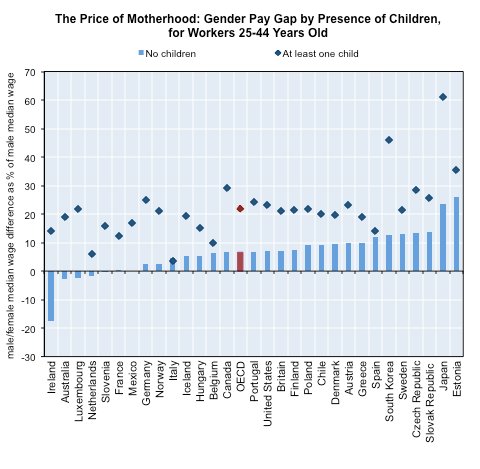 Gender pay gap is defined as the difference between male and female median wages divided by male median wages, for full-time workers only. “Children” defined as aged less than 16 years old. Source: Organization for Economic Cooperation and Development.
That chart is from the Organization for Economic Cooperation and Development’s latest report on the gender gap around the world. It shows that, among members of the O.E.C.D., the median woman without children who works full time earns 7 percent less than the median man working full time, whereas the median female full-time worker with children earns 22 percent less than the median male full-time worker.
The United States is about on trend with developed countries over all: in the United States, the median childless, full-time-working woman of reproductive age earns 7 percent less than the median male full-time worker. For women with children, the wage gap more than triples, to 23 percent. That gap in Japan is even bigger — the median Japanese mother working full time earns 61 percent less than the median Japanese full-time male worker.
And remember, those wage gaps are for full-time workers only. The gap widens if you compare all working mothers, since women are much more likely than men to work part time.
Why do mothers earn so much less than both men and childless women?
In the United States, much of the “mommy penalty” can be explained by the types of jobs mothers versus non-mothers take. In particular, compared with non-mothers, mothers end up in jobs that pay a higher share of their compensation in benefits rather than wages.
Benefits should play less of a role in most other rich countries, which have some form of universal health coverage. Occupational choice still accounts for much of the wage gap, though, as do differences in hours worked even among full-time workers.
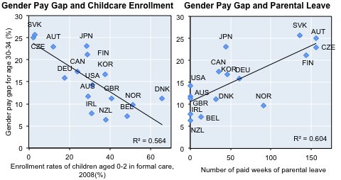
Access to child care appears to affect the motherhood penalty as well, the report says. Women are more likely than men to be the primary caregivers for their children, so if affordable child care is not available, women are more likely to take time away from their jobs to care for their children and be penalized with lower wages. Higher enrollment rates in formal child care programs are thus associated with smaller gender wage gaps.
 Source: Organization for Economic Cooperation and Development.
Interestingly, longer periods of maternity and parental leave are associated with a wider wage gap between men and women. The report notes that countries with more generous parental leave policies tend to have lower enrollment in formal child care programs.
Article source: http://economix.blogs.nytimes.com/2012/12/17/the-mommy-penalty-around-the-world/?partner=rss&emc=rss
