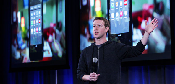
So vast and powerful is Facebook that it didn’t seem implausible when the rumors began: Facebook was about to introduce its own cellphone. Look on our works, Apple and Google, and despair!
The rumors were wrong. The new “Facebook phone” isn’t a phone. Instead, it’s a set of apps for phones running the Android operating system. Starting Friday, you can download them from the Google app store onto certain phones from HTC (One and One X) and Samsung (Galaxy S III, S 4 and Note II). More Android models will be compatible in the coming months, Facebook says. These apps also come preinstalled on the new HTC First, which costs $100 with a two-year ATT contract.
This software suite, called Home, replaces the standard Home screen and Lock screen of the phone.
In their places, what you see is a slowly scrolling parade of full-screen photos from your Facebook news feed. Text-only posts appear, too, using your friend’s primary profile picture (cover photo) as the photographic background.
The company says that at the moment, the Cover Feed — this parade of images on your Lock screen and Home screen — represents only about 80 percent of what you would see on the actual Facebook Web site.
What’s missing? Video posts and ads. Both, Facebook says, are coming soon. Yes, you read that right: the latest billboard for advertising is your own cellphone’s home screen. Are you ready for this?
You can have all kinds of fun on the Cover Feed. If the stately scrolling is too slow for your tastes, you can flick to the next photo, and the next, and the next.
You can double-tap the screen to “like” a post. You can hold a finger down on the screen to see the entire photo, smaller; big parts of it are generally chopped off in the process of enlarging it to fill the phone’s screen. And you can tap a tiny speech-balloon icon to read people’s comments, or to leave one of your own.
Facebook correctly points out that this sort of newsfeed screen saver is an excellent time killer when you’re standing in line or waiting for someone. At the same time, the Home software replaces the Home and Lock screens that Google or your phone maker designed. Unfortunately, you lose some good features in the process.
For example, for most people, the entire purpose of a Home screen is displaying app icons. But there are no icons on Facebook’s Home screens; Facebook thinks you’d rather use that space for reading Facebook updates.
The only icon that appears is your own profile photo. You can drag it to the left to open the Facebook Messaging app, to the right to open the last open app — or upward to open a grid of app icons on a gray background. Ah, here are the apps. But it’s awfully sparse; where are the rest?
They’re on a screen off to the left. Swipe your finger to see, on a black background, the usual Android “all apps” screen. From here, you can hold your finger down on a particular app’s icon to install it onto the gray-background launcher screen, which can have multiple pages.
If it sounds confusing, that’s because it is. In removing the app-launching function from the Home screen, Facebook has wound up having to reinvent the way you open programs on your phone, and the result feels like a hack. The black-background screen to the left lists all of your apps, and scrolls vertically; the nearly identical gray-background screen lists only your favorites, and scrolls horizontally. Got it?
Let’s hope you don’t use Android widgets much, either — those small windows on your Home screen that display news headlines and new e-mail messages. Facebook Home relegates them to Android’s traditional Home screens. They’re still accessible, though buried. (They appear when you tap the More button on the black-background app screen.)
E-mail: pogue@nytimes.com
Article source: http://www.nytimes.com/2013/04/11/technology/personaltech/facebooks-grab-for-your-phone-what-gives.html?partner=rss&emc=rss
