Uwe E. Reinhardt is an economics professor at Princeton. He has some financial interests in the health care field.
“Growth in U.S. health spending remains slow in 2010” was the headline of a news release on Jan. 9 by the Centers for Medicare and Medicaid Services, part of the Department of Health and Human Services. At an increase of 3.9 percent over national health spending in 2009, “the rates of health spending growth in 2009 and 2010 marked the lowest rate in the 51-year history of the National Health Expenditure Accounts,” the release said.
Today’s Economist
Perspectives from expert contributors.
The news was quickly picked up and disseminated by news organizations, including The New York Times.
What is one to make of this development? Is it evidence that we have finally “broken the back of the health care inflation monster,” as former Secretary of Health and Human Services Margaret Heckler famously put it in 1984. That was just after the Reagan administration had introduced the current prospective case-based payments for hospital inpatient care but two years before the health care inflation monster returned with a vengeance.
The charts below provide a longer-run perspective on health spending in the United States. They are all based on the rich data tables released annually by the Office of the Actuary of the Centers for Medicare and Medicare Services.
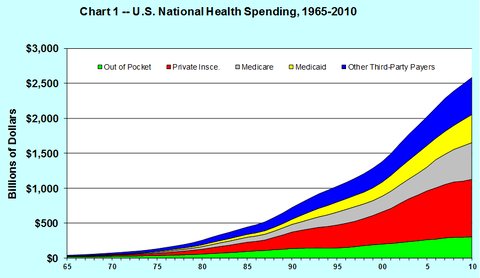
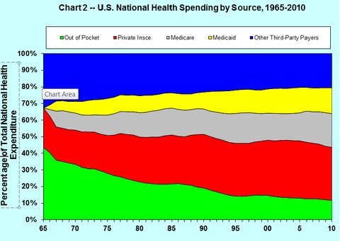
Charts 1 and 2 show the growth of health spending from 1965 to 2010, broken down by source of payment. Chart 1 exhibits the time path of actual health spending, not adjusted for inflation. Chart 2 exhibits the percentage of total national health spending contributed by the various sources in the chart.
In the charts the green area denotes out-of-pocket spending at the time health care is consumed, the red private health insurance, the gray Medicare, the yellow Medicaid and the blue “other third-party payments.”
The latter category is a grab bag of mainly public programs like spending by the Department of Defense, the Veterans Administration health system, the Indian Health Service, Workers’ Compensation, school health, general federal and state public-health activities and so on. Although each item in the list is relatively small, together these programs now add up to slightly over 20 percent of total national health spending.
Charts 1 and 2 illustrate the growing role of the Medicare and Medicaid programs in total health spending. They also show that out-of-pocket spending as a percentage of total national health spending has steadily decreased over time, even though the average American family probably feels that quite the opposite has occurred.
This is so because out-of-pocket spending for health care in dollars in the United States can rise even though as a percentage of total health spending it falls, because per-capita health spending in the United States is so large – typically twice as large as the corresponding figures in other nations.


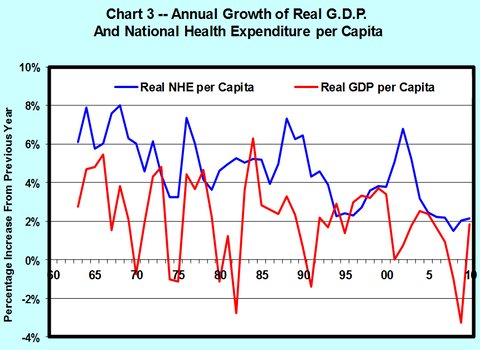
Charts 3 and 4 tell an interesting story. The red line in Chart 3 represents inflation-adjusted, real national health spending per capita in constant 2005 dollars. The blue line represents real, inflation-adjusted gross domestic product per capita. The G.D.P. deflator was used to adjust the two-time series for inflation (see Table B-7).


As the charts show, both real national health spending per capita and real G.D.P. per capita fluctuate considerably from year to year. On average, the growth rate of health spending has exceeded the growth rate of G.D.P., although in a few years the opposite occurred.
I am certainly not the first to notice this. Charts like these are old hat in the Office of the Actuary of the Centers for Medicare and Medicaid Services, and they have been remarked on in the literature for some time, as this example shows.
Charts 3 and 4 illustrate two additional points.
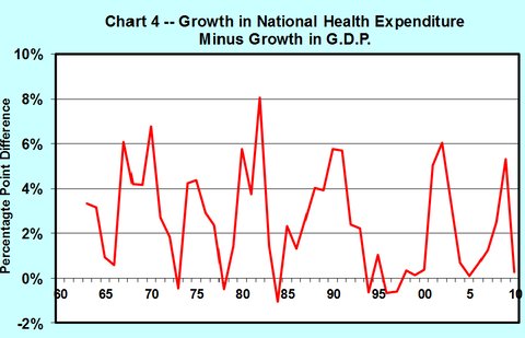
First, depending on the beginning and end points one chooses for calculation, the average percentage points by which the annual growth in health spending has exceeded the average annual growth in G.D.P. over the chosen period – a difference known among health policy analysts simply as “excess cost growth” – can vary quite a bit. One really needs charts like these to study the phenomenon, not point-to-point averages.
Second, the annual growth in real health spending per capita appears to have fluctuated around a long-run trend that has declined ever so gently over the longer period (see the blue line in Chart 3). That trend reflects in part that the annual growth in real G.D.P. per capita has also fluctuated around a gently declining trend line. As is shown in Chart 4, the trend line around which excess growth fluctuates is virtually flat.
The $64,000 question is how soon the excess growth of health spending will descend from its historical average of 1.5 to 2.5 percent first to, say, 1 percent or so, and eventually to 0 percent.
It is tempting to view the relatively lower cost growth in recent years as a first step in that direction. But nothing in the history of health spending in the United States suggests that this is the time to break out the Champagne to celebrate that victory.
After all, low rates of spending increases in 2009-10 could just be the lagged effect of the deep recession in 2008-9. There is evidence in the literature that health spending does not completely march to its own drummer, regardless of what happens in the rest of the economy, but instead tends to rise and fall somewhat with the rest of the G.D.P., albeit with a lag of one to two years. The safest bet is that on the long road to eventual zero excess growth in health spending, we will ride up and down quite a few more times on the health-spending roller coaster.
Now why is it reasonable to assume that excess cost growth will just have to decline to zero in the long run – that is, to assume that health spending will not eventually growth faster than G.D.P. and perhaps even more slowly?
Economists would explain such a trend as flows: as the fraction of G.D.P. devoted to health care increases, the added satisfaction, or utility, that people derive from added health care is likely to diminish relative to the added satisfaction derived from consuming more of other things. It could explain a gradual decline in the excess growth of health care spending.
Finally, economists retreat here to the one law on which they all agree, namely, Stein’s Law, named for the late economist Herbert Stein: “If something cannot go on forever, it will stop.” Trust us. It will, in the long run.
Article source: http://feeds.nytimes.com/click.phdo?i=86df176d7c9fa50dc4a83e04d14374f3