My company, Abe’s Market, is an online marketplace for natural and organic goods that connects Americans who want to live a more healthful lifestyle with passionate business owners they may not otherwise find. We get hundreds of thousands of visitors every month, and our monthly sales growth has been in double digits. Based in part on that experience, the editors of You’re the Boss have asked me to be the host of regular conversations on the blog about what works and what doesn’t when selling online. We’re looking for small businesses that would like to have their sites evaluated by the blog’s readers. (If you are interested in volunteering your site, please see below.)
This first post is about American Giant, a start-up clothing manufacturer that makes all of its clothing in America and sells online only. The company was founded by Bayard Winthrop, who has a rich understanding of how clothing is made and sold. He believes the current clothing supply chain is broken, and he thinks his opportunity lies in bypassing retailers and distributors to sell directly to consumers through the Web. He introduced American Giant last February, and he considers the company an ode to the glory days of American-made, high-quality cotton clothing.
That sounds nice, of course, but here is the obstacle: Can Mr. Winthrop persuade people to buy sweatshirts they cannot touch or try on? Will people buy based on images and word of mouth alone?
American Giant is a new brand with none of the market recognition enjoyed by companies like Lands’ End, Polo or Gap. Mr. Winthrop, who aims to take on those billion-dollar clothing brands, thinks American Giant, which is based in San Francisco and manufactures all of its products in the United States, can not only survive but conquer. But clearly the Web site — especially its photography — will be very important to that effort.
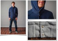
When the site was introduced in February, it featured the photos below. While the photos were professional, the team at American Giant, which has raised $2 million in start-up financing from Donald Kendall, a former chairman of PepsiCo, had doubts about their impact. Some feared that the photos felt flat, were contrived and provided little sense of the brand’s story.


The Web team also questioned the decision to cut off the model’s head instead of showing his face and making a personal connection. This led to an interesting dynamic. Early on, the site’s conversion rate — the percentage of visitors who actually make a purchase — was lower than projected. But the company was extremely successful with its social media and word-of-mouth marketing. This led to increased traffic, to styles’ selling out much faster than expected and to better than anticipated revenue (in fact, the clothing is selling so well — thanks in part to some very positive reviews — that the company cannot fulfill orders before March). But American Giant recognized that it was missing an opportunity to convert a larger percentage of its visitors from browsers to buyers.
I am a big fan of management that is critical of its own decisions and willing to revisit them quickly. Even though American Giant had already spent considerable amounts of money on its photography, it decided to invest a significant sum, $35,000, to redo the shots.

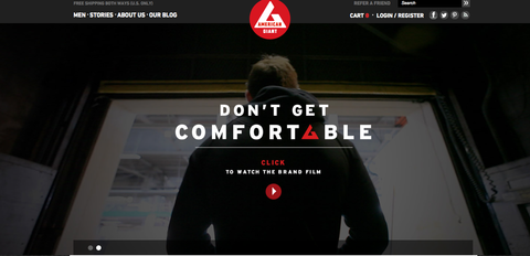
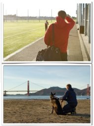
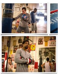
Right and below are some shots it recently unveiled on the site. The new theme focuses on real world heroes, showing the American Giant line in action on everyday people. Mr. Winthrop explained that the new tagline — “Don’t Get Comfortable” — is intended to create “an intimate and provocative look at what hard work and dedication is: a pillar of the American Giant brand.”
The crucial choice was not to use professional models. Instead, the company tapped local people, including a pastry chef, a creative agency strategist, a sports bar owner, an amateur boxer and a music producer, in an attempt to make the campaign more realistic and attainable. The team feels that the background and texture add visual interest, the lighting is more natural and the close-up shots of the sweatshirts demonstrate the fit.

To help display the new photography, the American Giant Web team added a home page carousel and three capsule features below it. Take a look at the photos below and at the redesigned site and tell us what you think.
As you look at the site, here are some questions to consider:
- Do you think the photography and the stories behind it make a difference?
- Was the money spent on new photography worth the investment?
- Should the company have focused more attention on, say, social media marketing?
- What would the site have to do to convince you that its products really are superior?
- Do the photos convey the company’s story in a compelling way that makes you want to buy the clothes?
Please share your comments below. In a follow-up column next week, we will tell you how American Giant has been doing since the redesign and what Mr. Winthrop thinks of your suggestions.
Would you like to have your business’s Web site or mobile app reviewed? This is an opportunity for companies looking for an honest (and free) appraisal of their online presence and marketing efforts.
To be considered, tell us about your experiences — why you started your site, what works, what doesn’t and why you would like to have the site reviewed — in an e-mail to youretheboss@abesmarket.com.
Richard Demb is co-founder of Abe’s Market, an online marketplace for natural products that is based in Chicago.
Article source: http://boss.blogs.nytimes.com/2013/01/23/can-a-web-site-get-visitors-to-feel-the-cotton/?partner=rss&emc=rss
Speak Your Mind
You must be logged in to post a comment.