Site Analysis
What’s wrong with this Web site?
In my last post, I asked, “Can a Marketing Contest Increase Sales for This Online Retailer?”
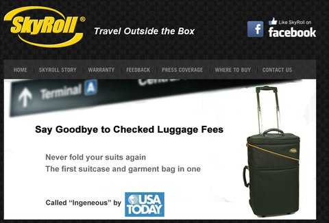
The online retailer, you may recall, was Don Chernoff, the inventor of SkyRoll, a carry-on bag that was designed to minimize wrinkles in suits and shirts. SkyRoll has sold thousands of units in retail stores but relatively few through the company’s Web site. In an effort to bolster the site’s traffic and sales, Mr. Chernoff created the “Crazy Carry-On Contest.” Unfortunately, the contest has done little to improve the site’s performance. We asked the readers of this column to take a look at the site and offer their views on why the site is failing to deliver sales and why the contest has failed to generate buzz.
As usual, the readers zeroed in on the crucial issues, offering insights and providing a lot of practical advice. When selling online, there are three things you have to do: make people want to buy your product, create a level of trust so people will be willing to buy from you and make the buying process as simple and intuitive as possible. The readers clearly believe (as do I) that the site has failed in all three areas.
Lucy, from Moab, Utah: “I wondered if there would be enough room for everything else I wanted to carry if I used this system. An artist’s line drawing of an X-ray view of the bag, with items nestled within and around the roll would be helpful. Or possibly a photo of everything that fit within the bag laid out for all to see. After all, potential customers of Skyroll already use a carry on roller bag AND a garment bag. Surely a concern would be, ‘Could I fit everything into this one bag?’”
Sporty from Atlanta: “The description on how to use the bag makes it sound really complicated and shuts down the sale. Why not simply do a lovely video that shows how easy it really easy to pack clothes. Additionally, it is not clear how much can fit in the cylinder. That can be shown on the video as well.”
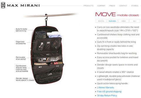
In addition, I’d like to give a big thank you to Jen in New York who found the site for Max Mirani luggage. This site succeeds in many ways that SkyRoll does not. Starting with the home page, the site has a clean, uncluttered design. And as you can see below, it demonstrates the capacity of the luggage through illustration and explanation, making it much easier for visitors to decide if this is the right product for them.

Readers also picked up on the fact that little seems to have been invested in the SkyRoll site. Lucy from Moab thought there needed to be “more excitement,” while Susan from North Carolina didn’t mince words. “It is a terrible Web site,” she wrote. “The paragraphs are disjointed, with way too many words. The product itself looks great, but obviously no one with marketing experience was involved. And frankly the Web site construction is flat and dated as well.”
New York’s Anonymous Coward summed up the issues: “The big problem is there is nothing on the home page that says this item is for sale. The site looks like a brochure and not an e-commerce site. There needs to be something on the front page that tells the visitors, ‘we sell great bags and you can BUY THEM NOW.’ Right now it just says ‘we make great bags’.”
Mr. Chernoff was especially interested in reader reaction to his Crazy Carry-On Contest, which was introduced in March but has generated little buzz. Site visitors were invited to submit photographs and videos of odd or unusual carry-on bags, but few have been submitted. The readers were not impressed.
Joshua from Maine: “It took me a while to find (the contest) on the site. It’s not really a contest if winning is that you own and post their picture on your site. You may consider a time frame and offering an actual prize, such as a free bag. The problem with the contest as it currently stands is that you first have to find the product, then the contest.”
Jen in New York: “I think the owner needs to be very clear on who his intended audience is, and then design the message and site accordingly. I can’t imagine that the ideal customer is the same person that might engage in this contest (photos/videos of funny, weird carry-ons might be more of a college student thing).”
The contest was also featured on SkyRoll’s Facebook page, but that did little to generate interest. “I checked out your Facebook page — obviously something that you want visitors to the site to do since it’s so prominent on the homepage,” wrote LeNerd. “You’ve got people submitting content on the Facebook page, but you’re not responding to them! Granted, you don’t have a large enough fan base yet to get a constant stream, but why would you leave those excited customers hanging out to dry? One person asked about submitting photos for the contest on the Facebook page, and you told them to do it via email instead. Why? It’s so much more compelling to see user-generated content right away!”
Mr. Chernoff Responds
Mr. Chernoff thought most readers missed the point. He was looking for better ways to promote the contest and was surprised how much people were focusing on the presentation of the contest on the Web. “I was not looking for advice on Web site design,” he said. “The Web site is not the vehicle for promoting the contest. Having people write or blog about it is the goal.”
He said it would be difficult to set deadlines for the contest or to offer rewards because, to date, there has only been one entry. “If we get a steady stream of entries and the contest gathers momentum,” he said, “I can see giving away a free SkyRoll every month or so to the best entry.”
He also dismissed the more general comments about the site. “There was a lot of hipster whining about our Web site, but very little actionable advice,” he said. “I disagree with the many comments that say I need a ‘call to action’ and that the site isn’t ‘sales oriented.’ The site is designed to explain a product that is unique and benefits from explanation. It is easy to buy one. There is a ‘Where to buy’ link on the home page and a ‘buy now’ button on each product page.”
My Take
Mr. Chertoff says his goal is to get bloggers to write about the “Crazy Carry-On Contest” because he feels that kind of attention will create buzz, traffic, participation and, ultimately, more sales. But I’m not sure he understands the way bloggers and other “influencers” work.
Some influencers wield enormous power. The reason they enjoy huge audiences is because they provide information that is of real value to their audiences. They succeed because they do their homework and only endorse Web sites and products that they genuinely like and respect.
Every time influencers recommend a site or a product, they put their own credibility on the line. And contrary to what Mr. Chernoff says, his Web site is the most important place for promoting the contest. Unless your site presents the contest in a creative and fun way, no influencer is going to risk his or her credibility by sending readers to your site.
If Mr. Chernoff is fortunate enough to get bloggers to visit his site, what will they find when they get there?
• The contest is buried on the bottom navigation of the home page.
• The contest page looks slapped together.
• The few photographs posted aren’t particularly “crazy.”
• The videos have nothing to do with the contest.
• There are no prizes offered.
• There is no time frame.
This is not a case of “build it and they will come.” Mr. Chernoff needs to build it extremely well before anyone will come — and recommend that others follow. This will not be cheap and this will not be easy. A Web site and its marketing and promotion are a reflection of the brand behind the site. If a contest looks slapped together, it will all but guarantee that visitors will not come back — and they certainly won’t buy from your site.
While Mr. Chernoff was not looking for a review of his Web site, the site itself is at the heart of the difficulties he has been having. Without a redesign and a more creative and structured approach to the contest, the site will not draw much traffic, the contest will not get much buy-in and visitors will not purchase SkyRolls in significant numbers.
When conceiving a contest — or any other attempt to drive traffic with user-generated content — it’s important to keep a few things in mind:
• Make sure the contest aims at an audience of potential and current customers.
• Give them incentives to contribute (prizes, recognition).
• Give them reasons to keep coming back (pick daily, weekly, monthly winners or featured contributors).
• Promote the contest through multiple channels (like Facebook, Twitter and YouTube).
• Promote the contest on appropriate travel blogs.
• Create new contests and promotions on a regular basis.
A good example is a contest created by the Irish brewery Guinness. The Guinness Storehouse is a combination museum, visitor center, pub, brewery and restaurant. Thousands of visitors tour the storehouse each year, so Guinness created a contest to encourage visitors to share their photos of the Storehouse online. More than 20,000 people have done so, making the contest an enormous success. The contest offers monthly prizes, and it awards a grand prize of 1,000 pounds. And Guinness actively promotes the contest on its Twitter account.

Here’s the bottom line: Any business that fails to take its online business as seriously as its offline business is committing economic suicide. Introducing a mediocre Web site or online promotion with a minimal budget and little thought is worse than a waste of money. It sends a message that you are unprofessional or incompetent or both. Your Web site can be your single most important marketing and sales tool. Do it right or don’t do it at all.
Would you like to have your business’s Web site or mobile app reviewed? This is an opportunity for companies looking for an honest (and free) appraisal of their online presence and marketing efforts.
To be considered, please tell me about your experiences — why you started your site, what works, what doesn’t and why you would like to have the site reviewed — in an e-mail to youretheboss@bluefountainmedia.com.
Gabriel Shaoolian is the founder and chief executive of Blue Fountain Media, a Web design, development and marketing company based in New York.
Article source: http://feeds.nytimes.com/click.phdo?i=801a5f83aefb4ef3b33ef8d717cc7f5a
Speak Your Mind
You must be logged in to post a comment.