 Marilynn K. Yee/The New York TimesSusan and Steve Karasanti: “This was an awesome experience.”
Site Analysis
What’s wrong with this Web site?
Last week, my post asked whether a small retailer can compete online with the big boys.
The answer to that question is yes, but only if the small retailer creates an online presence that differentiates itself from the competition. The site has to have a great design, and it has to have the structure and navigation to make the purchasing process simple and intuitive.
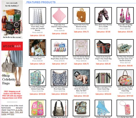
The retailer we looked at, Little Dudes and Divas, sells clothes and accessories for babies and toddlers, as well as accessories for the parents of babies and toddlers. The readers of this column clearly want to see Little Dudes and Divas — and its owners Steve and Susan Karasanti — beat its bigger competitors, but they generally felt that the site has too many issues to do so.
For example, the readers were nearly unanimous in their view that the site is too cluttered. “Wow, what a mess,” Micah Choquette wrote. “You have so many things trying to get my attention, it’s actually impossible to pay much attention to anything. I’d trim the home page down to probably 20 percent of what they have on there now: focus on specials, brand names and strip your testimonials down to one with a link to the others. Featured products should probably be condensed to four or five, not 20.”
Or as Manwich in Connecticut put it: “Your site suffers from too much selection, where shoppers can look at page after page of items. There is a missed opportunity here to make some decisions for the customer, be taste makers and put a heavier focus on a smaller selection of items, which can give the impression of a truly hand-picked selection.”

Clutter can make it difficult to compete with more sophisticated sites. Because Little Dudes and Divas hopes to sell high quality, hard to find brands, this is a big deal. As Friend in New England put it, “I don’t like the site because they’re selling high-end products but the visual appearance of the store is bargain basement. If I’m buying expensive products I expect the Web site to have sophisticated graphic design with attractive, thoughtfully chosen colors and fonts. I went to the Coach Web site to compare and that site is gorgeous! The pages look like a fashion magazine in style and layout, and the bags look like works of art.”
Many of those who commented expressed support for the Karasantis and indicated that they would prefer to support a small business. In this case, through, the small business may not be making a strong enough case for itself.
“Why would you buy from this site instead of one of their bigger competitors?” asked Morgan S. of Atlanta. “I probably wouldn’t. This site doesn’t tell me that they are super customer-focused. This site communicates that they are just another mass retailer. What makes them special? What makes me want to a) buy from them and b) come back?”
Steve Karasanti Responds
Mr. Karasanti was remarkably gracious in his response to the commenters’ tough love. “This was definitely an eye-opening experience,” he said. “The comments were well thought out and very informative.”
He admitted to being surprised by the overall impression that the site is too cluttered and visually unappealing. “I thought we did a good job on the redesign, but I guess we fell short,” he said. “It seems that most of your readers agree that less is more when it comes to shopping online.”
He said he planned to take immediate action to fix the site. “We will start by cleaning up the home page and focusing on a clean and visually pleasing design with less clutter,” he said. “We will do more to convey the message about our customer service. We will try to showcase our story on the site so customers know more about who we are and what we do.”
As readers of this column know, not every site we have reviewed has been so receptive to the reader comments (for example, there’s this review). But Mr. Karasanti has fully embraced the comments and the suggestions. “This was an awesome experience,” he said. “I’ve learned so much from your readers. I would recommend this to anyone who owns a Web site and wants to improve on it. I hope that other business owners can benefit from the comments about our site. I know I did! I would like to thank everyone who took the time to write these comments about our site. We are excited to see how these changes will make a difference in our business. Thank you for the opportunity.”
My Take
I think the comments about clutter are absolutely right. I look at this site and see a lot of stuff, but I don’t know what kind of stuff. When you use a term like featured products, you are telling your visitors that you have taken the time to select products that you think they will be interested in. But when your home page is crammed with featured products, and there is no clear organization of those products, you are going to confuse and frustrate your visitors.
As a result, there is a gap between what the Karasantis say they want the site to be and what I see on the site. They tell me that their business is about offering exceptional customer service and great brands that you won’t find on other sites. But why aren’t they delivering that message on the home page in a bold, clear way? They are competing with some awfully big stores that have built up a huge amount of consumer trust. To beat the big boys, you have to provide something they can’t. If you have better customer service than the big stores, emphasize it. If you have products they don’t offer, emphasize it.
When I dig into the site, I see they do have good products and they do offer strong service, including a lowest price guarantee and free shipping for orders over $50. And that’s all fine, but very few visitors are going to take the time to dig that deeply. You have to make your value proposition clear.
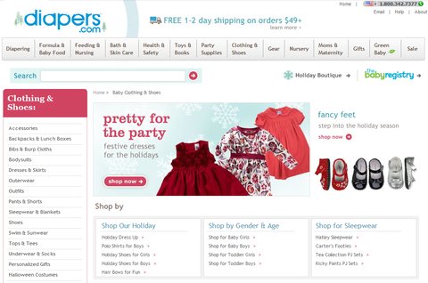
Take a look at the difference between this site and Diapers.com. See how clean and inviting the home page is. The design is warm, the value proposition is clear, and the navigation is intuitive, with major categories on top and useful filters on the left. Now look at the page that competes most directly with Little Dudes and Divas, the “Clothing Shoes” page:

Instead of bombarding you with dozens of products, this site highlights seasonal clothes and makes it simple to find exactly what you’re looking for. There is no clutter. If you were going to buy from one of these two sites, which one would you choose?
Little Dudes and Divas is a small business run by people who know their business and have great products and service. But they have done themselves a disservice. Look at how many of the commenters told the Karasantis that they need to invest in a redesign. I agree.
Would you like to have your business’s Web site or mobile app reviewed? This is an opportunity for companies looking for an honest (and free) appraisal of their online presence and marketing efforts.
To be considered, please tell me about your experiences — why you started your site, what works, what doesn’t and why you would like to have the site reviewed — in an e-mail to youretheboss@bluefountainmedia.com.
Gabriel Shaoolian is the founder and chief executive of Blue Fountain Media, a Web design, development and marketing company based in New York.
Article source: http://feeds.nytimes.com/click.phdo?i=1283bb7dac59cef8abe87cbe5eb80c9c
Speak Your Mind
You must be logged in to post a comment.