Site Insight
What’s wrong with this site?
For me, writing this column brings two fascinating benefits: the people I get to meet and the information they share. Because my days at AbesMarket.com are filled with e-commerce decisions, I appreciate the value of baseline data, and knowing how visitors act on other sites helps me gauge our performance. I hope you, too, can benefit from these ideas and statistics.
In last week’s post, we met Recruiterbox, a three-year-old start-up that organizes the recruiting process. Having grown through smart and frugal marketing, Raj Sheth and his co-founders are debating how to guide their company to the next set of customers. Their focus has been on companies with fewer than 50 employees. Larger companies have more to spend on recruiting, but also demand a more resource-intense sales approach.
We left off asking readers for feedback on which market Recruiterbox should emphasize. We also asked whether you thought the site was easy enough to understand.
One comment suggested focusing on the potential of the small- to medium-size business market. In fact, the commenter went so far as to suggest focusing on start-ups and small enterprises in India and Silicon Valley. His point was that the $100-per-month cost would be easy for these companies to digest given the value Recruiterbox offers. I agreed wholeheartedly that the company should avoid the temptation of catering to larger companies. While the appeal of increasing revenue per client can be tough to resist, it comes with three key obstacles.
- Larger companies mean more decision makers, which translates into a significantly longer sales cycle.
- Recruiterbox does not have an outbound sales team to sell into that market. This is a significant cost savings but makes outreach to bigger companies tougher.
- Large companies are often swayed by reputation, and because Recruiterbox is relatively new to the market, it does not have the corporate credibility that a human resources executive may be expecting.
Other comments provided feedback on how the site functions. I challenged Mr. Sheth with these thoughts, and he shared some of his core site statistics to support his answers.
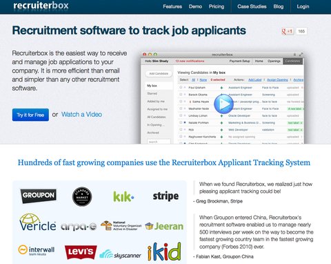
Is the Try It for Free button too easy to miss?
We used color to help make that button stand out. It is the only blue button on the site. Eighty-four percent of the people who hit the homepage end up clicking on the button. That works for us although we also want people to watch the video to get a feel for the product. On average 7 percent of the visitors that click on the Try It for Free button sign up for the trial version.
At three minutes, isn’t the video too long?
We have remade this video three times. The actual site demo takes 15 to 20 minutes, so it was quite an effort to edit that video down to three minutes. Seven percent of our visitors watch the whole video — or roughly 2,000 of our 30,000 monthly visitors. We don’t have stats on the number of people who start to play it and then stop in the middle. We haven’t made the investment in producing a one-minute concept video although we do understand the value of one. The positive side is that after watching the current video many of our potential customers can jump right in because they understand how to use the application.
On the homepage, why not have the Reasons You’ll Love It section follow the video instead of the Social Proof? Why not put some of that information on a separate page.
This isn’t a focus because so few people scroll down below the fold. Approximately 90 percent of the visitors click on either the Try It for Free button or the video. As to potentially separating those sections into different pages, we believe having all of the key information on the homepage raises our search engine optimization ranking.
Can the text on the homepage explaining what you do be more concise?
We have struggled with that line, appreciate that feedback and agree it could be improved.
Why don’t you advertise on Monster.com or other job sites?
We have tried partnering with job sites but have not made progress. We aren’t relevant to the job seeker, only to the employer, so we are looking to structure a relationship that only shows our ads to employers.
How do you use customer feedback?
We receive a few hundred e-mails per month from paying and trial customers. This is in addition to the feedback we get during our two to three demo calls every day. It is a big advantage to be this close to our customer. We are careful to filter the feedback based on the size of the company — large companies provide different feedback than their smaller counterparts. We compile the feedback, and it drives our development road map, what features we add and when.
Would you like to have your business’s Web site or mobile app reviewed? This is an opportunity for companies looking for an honest (and free) appraisal of their online presence and marketing efforts.
To be considered, please tell us about your experiences — why you started your site, what works, what doesn’t and why you would like to have the site reviewed — in an e-mail to youretheboss@abesmarket.com.
Richard Demb is co-founder of Abe’s Market, an online marketplace for natural products that is based in Chicago.
Article source: http://boss.blogs.nytimes.com/2013/03/06/are-big-clients-worth-the-effort-for-this-web-start-up/?partner=rss&emc=rss