November 23, 2024

Bits: If Our Gadgets Could Measure Our Emotions

“Honey, we know,” my mom replied. “But it should!”

She had a point. After all, computers and technology are becoming only smarter, faster and more intuitive. Artificial intelligence is creeping into our lives at a steady pace. Devices and apps can anticipate what we need, sometimes even before we realize it ourselves. So why shouldn’t they understand our feelings? If emotional reactions were measured, they could be valuable data points for better design and development. Emotional artificial intelligence, also called affective computing, may be on its way.

But should it be? After all, we’re already struggling to cope with the always-on nature of the devices in our lives. Yes, those gadgets would be more efficient if they could respond when we are frustrated, bored or too busy to be interrupted, yet they would also be intrusive in ways we can’t even fathom today. It sounds like a science-fiction movie, and in some ways it is. Much of this technology is still in its early stages, but it’s inching closer to reality.

Companies like Affectiva, a start-up spun out of the M.I.T. Media Lab, are working on software that trains computers to recognize human emotions based on their facial expressions and physiological responses. A company called Beyond Verbal, which has just raised close to $3 million in venture financing, is working on a software tool that can analyze speech and, based on the tone of a person’s voice, determine whether it indicates qualities like arrogance or annoyance, or both.

Microsoft recently revealed the Xbox One, the next-generation version of its flagship game console, which includes an update of Kinect, its motion-tracking device that lets people control games by moving their hands and bodies. The new Kinect, which goes on sale later this year, can be controlled by voice but is not programmed with software to detect emotions in those interactions.

But it does include a higher-definition camera capable of tracking fine skeletal and muscular changes in the body and face. The machine can already detect the physics behind bodily movements, and calculate the force behind a punch or the height of a jump. In addition, one of the Kinect’s new sensors uses infrared technology to track a player’s heartbeats. That could eventually help the company detect when a player’s pulse is racing during a fitness contest — and from excitement after winning a game. For avid gamers like myself, the possibilities for more immersive, interactive play are mind-boggling.

Albert Penello, a senior director of product planning at Microsoft, says the company intends to use that data to give designers insight into how people feel when playing its games — a kind of feedback loop that can help shape future offerings and experiences. He says Microsoft takes privacy very seriously and will require game developers to receive explicit permission from Xbox One owners before using the data.

Microsoft says games could even adapt in real time to players’ physical response, amping up the action if they aren’t stimulated enough, or tamping it down if it’s too scary. “We are trying to open up game designers to the mind of the players,” Mr. Penello said. “Are you scared or are you laughing? Are you paying attention and when are you not?”

Eventually, he said, the technology embedded in the Kinect camera could be used for a broader range of applications, including tracking reactions while someone is looking at ads or shopping online, in the hope of understanding what is or isn’t capturing the person’s interest. But he said those applications were not a top priority for the company. (Some companies have experimented with technologies like eye-tracking software to see what parts of commercials draw the most attention from viewers.)

Online media companies like Netflix, Spotify and Amazon already have access to real-time consumer sentiment, knowing which chapters, parts of songs, movies and TV shows people love, hate, skip and like to rewatch. Such data was used to engineer the popular online Netflix series “House of Cards,” whose creators had access to data about people’s television viewing habits.

So it is not much of a leap to imagine Kinect-like sensors, and tools like the ones Affectiva and Beyond Verbal are developing, being used to create new entertainment, Web browsing and search experiences.

The possibilities go far beyond that. Prerna Gupta, chief product officer at Smule, a development studio that makes mobile games, spoke about the subject at South by Southwest, the conference in Austin, Tex., in March. She called her talk “Apps of the Future: Instagram for Cyborgs,” and gazed far into the future of potential applications.

Article source: http://www.nytimes.com/2013/06/02/technology/if-our-gadgets-could-measure-our-emotions.html?partner=rss&emc=rss
State of the Art: Facebook’s Grab for Your Phone. What Gives?

So vast and powerful is Facebook that it didn’t seem implausible when the rumors began: Facebook was about to introduce its own cellphone. Look on our works, Apple and Google, and despair!

The rumors were wrong. The new “Facebook phone” isn’t a phone. Instead, it’s a set of apps for phones running the Android operating system. Starting Friday, you can download them from the Google app store onto certain phones from HTC (One and One X) and Samsung (Galaxy S III, S 4 and Note II). More Android models will be compatible in the coming months, Facebook says. These apps also come preinstalled on the new HTC First, which costs $100 with a two-year ATT contract.

This software suite, called Home, replaces the standard Home screen and Lock screen of the phone.

In their places, what you see is a slowly scrolling parade of full-screen photos from your Facebook news feed. Text-only posts appear, too, using your friend’s primary profile picture (cover photo) as the photographic background.

The company says that at the moment, the Cover Feed — this parade of images on your Lock screen and Home screen — represents only about 80 percent of what you would see on the actual Facebook Web site.

What’s missing? Video posts and ads. Both, Facebook says, are coming soon. Yes, you read that right: the latest billboard for advertising is your own cellphone’s home screen. Are you ready for this?

You can have all kinds of fun on the Cover Feed. If the stately scrolling is too slow for your tastes, you can flick to the next photo, and the next, and the next.

You can double-tap the screen to “like” a post. You can hold a finger down on the screen to see the entire photo, smaller; big parts of it are generally chopped off in the process of enlarging it to fill the phone’s screen. And you can tap a tiny speech-balloon icon to read people’s comments, or to leave one of your own.

Facebook correctly points out that this sort of newsfeed screen saver is an excellent time killer when you’re standing in line or waiting for someone. At the same time, the Home software replaces the Home and Lock screens that Google or your phone maker designed. Unfortunately, you lose some good features in the process.

For example, for most people, the entire purpose of a Home screen is displaying app icons. But there are no icons on Facebook’s Home screens; Facebook thinks you’d rather use that space for reading Facebook updates.

The only icon that appears is your own profile photo. You can drag it to the left to open the Facebook Messaging app, to the right to open the last open app — or upward to open a grid of app icons on a gray background. Ah, here are the apps. But it’s awfully sparse; where are the rest?

They’re on a screen off to the left. Swipe your finger to see, on a black background, the usual Android “all apps” screen. From here, you can hold your finger down on a particular app’s icon to install it onto the gray-background launcher screen, which can have multiple pages.

If it sounds confusing, that’s because it is. In removing the app-launching function from the Home screen, Facebook has wound up having to reinvent the way you open programs on your phone, and the result feels like a hack. The black-background screen to the left lists all of your apps, and scrolls vertically; the nearly identical gray-background screen lists only your favorites, and scrolls horizontally. Got it?

Let’s hope you don’t use Android widgets much, either — those small windows on your Home screen that display news headlines and new e-mail messages. Facebook Home relegates them to Android’s traditional Home screens. They’re still accessible, though buried. (They appear when you tap the More button on the black-background app screen.)

E-mail: pogue@nytimes.com

Article source: http://www.nytimes.com/2013/04/11/technology/personaltech/facebooks-grab-for-your-phone-what-gives.html?partner=rss&emc=rss

Bucks Blog: Thursday Reading: Where Donated Cars May End Up

December 20

Thursday Reading: Where Donated Cars May End Up

Where donated cars may end up, filling blank walls on a budget, fun smartphone apps for the holidays and other consumer-focused news from The New York Times.

Article source: http://bucks.blogs.nytimes.com/2012/12/20/thursday-reading-where-donated-cars-may-end-up/?partner=rss&emc=rss

Tool Kit: Apps and Accessories Help Make the iPad a Scaled-Down Darkroom

In the late 1990s, after college, I snapped so many photos that I ended up building a 5-by-6-foot darkroom in the corner of my living room in Brooklyn. There, standing amid long, dark strips of film under the glow of a dim red light, I spent countless hours mixing pungent chemicals and developing and printing photographs.

I have since retired most of my film cameras. Now, my camera bag is all digital, and my darkroom is 7 inches wide and 9.5 inches long: an Apple iPad.

The chemicals I once used have been replaced by a tiny, white USB connector that allows me to transfer my photos from any digital camera into the iPad in a matter of seconds.

What inspired me to jump from film to digital was immediacy — or impatience, depending on how you look at it. In the old days, I’d have to finish a roll of film, get home, develop it, wait, then wait some more. With digital, you snap a picture and there it is, like magic, on the back of your digital camera. With the iPad as a darkroom, it’s also editable immediately.

Editing your photos on an iPad instead of a conventional laptop also means you can carry one device fewer on your travels. Although most applications on the iPad will shrink the size and therefore the quality of your images when you import them, there are apps that can deal with full-size images. You can even connect wirelessly to printers intended to work with the iPad.

For older iPads with a 30-pin connection, Apple sells the $29 Apple iPad Camera Connection Kit. It comes with two connectors that plug directly into the iPad’s base. One has a USB cable slot, which works with almost any camera, and the other has a slot for SD memory cards.

There are also many less expensive third-party connectors, including a 2-in-1 Camera Connection Kit ($10) available from Amazon.

The cables for newer iPads, with the lighting connector, are overpriced, with each connector costing $30.

To transfer the photos from your camera, you plug a connector into the base of your iPad, connect your camera with a USB cord, then turn the camera on. The iPad will detect that the device is connected and allow you to select which images you would like to import. It’s quicker than a Polaroid.

The immediacy of digital has pushed photographers to want to edit their photos and then share them right away. A number of applications allow you to do this, some free and some costing as much as $20.

SnapSeed ($5) is an app made specifically for multitouch photo-editing. Sliding your finger up and down on the screen will allow you to alter the image, changing the contrast, brightness or saturation. A feature called Selective Adjust allows you to drag little adjustable pointers all over a picture to tweak the lighting in specific areas.

Apple’s own iPhoto application ($5) for the iPad also has some advanced features. You can apply filters, turning a color photo into a sepia or “vintage” image. If you’re in a rush, “auto-enhance” will try to improve the image for you. There are also brushes that pop out from the bottom of the screen, making your iPad feel like a painter’s palette. These can be used to remove red-eye and soften or sharpen an image.

Adobe, the big maker of graphics and photoediting software, offers two photo-specific iPad applications. Photoshop Express, which is free, has some limited editing features, like adjusting tint, saturation and exposure, but it’s really for novices. Advanced users will want to try Photoshop Touch ($10). This application offers similar controls to Adobe software on a standard computer — layers, curves, the ability to add text, and other advanced features. But be warned: the app is somewhat confusing to navigate, and you will have to take some time with its tutorial before jumping in.

For photographers who want to take iPad editing to another level, there are more advanced — and expensive — options.

Jeff Carlson, author of the book “The iPad for Photographers,” sometimes bypasses the iPad camera connection kit in favor of an EyeFi SD card and an app called ShutterSnitch ($16). EyeFi cards, which range from $40 to $100 depending on speed and memory size, can connect directly with your iPad wirelessly. Mr. Carlson said that although EyeFi offers a free app, ShutterSnitch is much faster and has a more advanced interface.

Mr. Carlson said he sometimes captures RAW images with his digital cameras. These are uncompressed and large files, often used by professional photographers because they preserve more of the image quality than standard JPEG files. To handle these files he sometimes uses the apps piRAWnha or Photoraw, both $10. But his favored application is Photosmith ($20) an advanced tool that can wirelessly transfer pictures to your desktop computer for printing or editing later.

The only question remaining is which iPad to use. The newer iPads with retina displays are the best choice for editing, as the screen is phenomenally crisp. But they are also expensive. Of course the iPad Mini is lighter, and a fraction of the price, so it might be a better option for vacation snaps. But if you’re someone who really wants to get into your digital photos, you might be disappointed with the Mini’s screen resolution and prefer the big version.

Although digital cameras have changed the way most photographers shoot, I haven’t retired all of my film equipment just yet. There is one area of photography that most app makers and digital camera companies seem to have neglected: black and white.

All of the apps mentioned in this article can strip the color out of an image like a scene from the movie “Pleasantville,” but none have succeeded in recreating the authentic look of black and white photos. In most instances, shooting black and white on digital cameras can feel like making a pizza in a microwave: sure, it looks like a pizza, but it’s just not right.

So every once in a while I will still shoot a roll of 3200-speed black-and-white film on one of my old cameras. Then off I go to a darkroom to get it developed. Nowadays, while I sit waiting amid those pungent and familiar smells, I have my digital darkroom with me, and I edit photos on my iPad while the chemicals work their magic.

Article source: http://www.nytimes.com/2012/12/06/technology/personaltech/apps-and-accessories-help-make-the-ipad-a-scaled-down-darkroom.html?partner=rss&emc=rss

Bucks Blog: Thursday Reading: Tree Removal Without Loss of a Limb

November 22

Thursday Reading: Tree Removal Without Loss of a Limb

Poisonous backyard mushroom soup, apps for new iPad users, removing downed trees without losing a limb and other consumer-focused news from The New York Times.

Article source: http://bucks.blogs.nytimes.com/2012/11/22/thursday-reading-tree-removal-without-limb-loss/?partner=rss&emc=rss

Bits Blog: Google Uses Its Home Page to Push Nexus 7 Tablet

Google’s stark white home page, the most-viewed Web site on the Internet, would be any advertiser’s dream. On Tuesday, Google took full advantage of that — for itself.

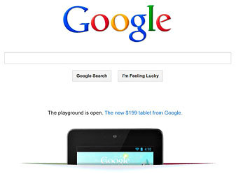
Google is running an ad on Google.com for the Nexus 7, its 7-inch, $199 tablet computer that competes with the Kindle Fire. It shows the tablet popping up from what looks like a slit cut through the home page and announces, “The playground is open. The new $199 tablet from Google.” Clicking the link takes you to the Google Play store to buy the Nexus 7 and see a promotion for the other things the store sells, like apps, games, books, music and TV shows.

Though it is rare, this is not the first time that Google has advertised its products on the valuable ad space of its home page, which 183 million people see every month. It did so for the Nexus S cellphone and the Google Plus social network, for instance, and has used the home page for causes, like directing people to the remembrance of Steven P. Jobs on Apple.com after he died.

For people who use browsers other than Google’s Chrome browser, the company also shows ads for Chrome on the homepage.

But the ad for the Nexus 7 and Google Play store comes at a crucial time for Google. The tablet has been selling well, but competition is on the way, with product announcements by Amazon.com and Apple expected next month.

And in order for Android devices like the Nexus 7 to be successful, Google has to convince people to invest in apps and media from its store instead of others, like Apple’s, which is one reason that its Nexus Q media streaming device faltered. Also, Android is under attack after the verdict last week that some of Samsung’s Android phones infringed on some of Apple’s patents. Though the Nexus 7 is made by Asus, Google may have to tweak Android to avoid violating patents.

These are all reasons that Google has been making a major advertising effort on behalf of the Nexus 7. In addition to the home page ad, it has run display and AdWords ads across the Web, full-page color ads in newspapers and magazines, TV ads and billboards, including one near the San Francisco International Airport.

Article source: http://bits.blogs.nytimes.com/2012/08/28/google-advertises-its-nexus-7-tablet-on-its-homepage/?partner=rss&emc=rss

Bucks Blog: Monday Reading: Apps to Entertain Children While Traveling

December 26

A Plan for 2012 That You’ll Actually Follow

Too many financial plans are set adrift by habits that we barely know we have, so commit to small, trackable changes in 2012.

Article source: http://feeds.nytimes.com/click.phdo?i=519d6ddbb21a453f0faa68d3ff8509bb

When an Android Phone Becomes a GPS Device

To my surprise, on the way there, it looked as if the smartphone was performing as well as the Garmin GPS device. But also to my surprise, sometimes they were both about as good as leaning out the window and getting advice from a stranger.

The smartphone found the exact name of the cinema but somehow placed it 75 miles and 90 minutes away. The GPS device seemed to nail it; I recognized the exit it told me to take and I took it. Then, following its turn-by-turn directions, I found myself blocks away in the middle of a residential street, with no cinema in sight.

Thanks to both, I missed the first 20 minutes of the movie.

As most users will testify, all GPS devices make mistakes, whether you have spent $2,000 for an in-car navigation system or one-tenth the price for the same features on a portable device.

Now drivers should be asking themselves: why do I need to spend even $200 for a GPS unit that sometimes makes mistakes when a just-as-smart (or dumb) smartphone can do the same thing?

Owners of smartphones that run the Android operating system are finding an even better reason: the navigation advice on an Android phone is free.

Google’s no-cost Maps app, bundled with Android smartphones, includes voice directions and turn-by-turn navigation, just like the stand-alone big boys. (This is a category in which Androids clearly trump iPhones. The iPhone’s Google Maps app does not offer these features.)

But is a free smartphone app as good as a device specifically designed for navigation? I set out to find out with a side-by-side test.

The manufacturers of navigation hardware, who have seen sales of stand-alone units drop almost 20 percent since their 2008 peak, argue that free and low-cost smartphone navigation apps and stand-alone devices can coexist. Each appeals to a different kind of person. Younger people are attracted to apps, while older drivers like stand-alone devices with larger screens, according to Bill Strand, Magellan’s senior product marketing manager.

To test this premise, I stuck Garmin’s Nuvi, model 2350LMT ($185), and Motorola’s latest Android phone, the Droid X2, onto the dashboard of my Audi. (There are hundreds of GPS models; I selected the Garmin as the representative because of its popularity.) Peering over this bank of devices, I took off with the children onto Los Angeles’s traffic-choked Ventura Freeway and down to Disneyland.

The Droid and Garmin both have 4.3-inch screens. The Droid’s screen was brighter and, with its reflective surface, appeared very sharp.

I typed in “Disney Grand California Hotel and Spa,” and the slight vibration let me know when a key push had been registered. By contrast, I often pushed the wrong button on the Garmin.

Each device’s maps were easy to follow and read; the graphics style comes down to personal preference. But if you like to catch a bird’s-eye view of your travels, only Google offers a satellite view of your route, much like its satellite view on a Google map on a computer. Graphic maps work just as well, but I found something satisfying about seeing what is really there on the ground.

When you approach your destination, Google Maps automatically switches to its familiar street view, giving a street-level shot of where you (hopefully) want to be. Using Google Maps to find my way home, I found it a bit discomfiting to suddenly see a photo of my house — that I hadn’t shot — as I drove up to it.

In navigation, seconds can mean the difference between getting off on the correct freeway exit or driving an extra 10 or 20 miles to the next one. Google Maps was generally quicker; at times, its voice commands arrived as much as three seconds sooner, which could make all the difference if your reflexes are not that snappy.

Google Maps also took first place when it came to searching for a destination. A search for the nearest Peet’s coffee stores on the Garmin took 27 seconds — and it never found the one closest to my home. The Garmin did not find it even when I was parked in front of the store. Perhaps Garmin’s maps supplier is a Starbucks fan.

Alas, speed does not always translate into accuracy. Neither of the devices was ever completely accurate, either in determining the shortest route or figuring out the location of an address.

Article source: http://feeds.nytimes.com/click.phdo?i=45cb6e93ea6a7c610968ccc7da8bae5f

Bucks Blog: Thursday Reading: Obama’s Push for Job Creation Measures

August 18

Thursday Reading: Obama’s Push for Job Creation Measures

The president’s push for new jobs, health care cuts may slow industry hiring, apps for wine lovers and other consumer-focused news from The New York Times.

Article source: http://feeds.nytimes.com/click.phdo?i=0aefd97659c1c4a41a32714545e1f6c3

App City: Ordering Food by Phone, Without Saying a Word

PLATFORM iPhone, Android

PRICE Free

APP Seamless

PLATFORM iPhone, Android,

BlackBerry

PRICE Free

It seems like a small difference, but getting food delivered by using an online service instead of calling the restaurant makes it hard to imagine going back to the days of dialing. And in recent years, several companies offering such services have grown in popularity, signing up new restaurants and creating ever more efficient ways to serve their couch-bound clientele.

Two of the leading services, GrubHub and Seamless, which started as Web sites, say that an increasing amount of their business is taking place via smartphones. Both updated their apps in recent weeks.

GrubHub revamped its Android app so that it resembles the iPhone version. Seamless added several nice features, like a map that shows the location of the restaurant as you look at its menu.

Placing an order through either service is simple. Once you find a restaurant, it is easy to browse through the menu, checking off the items you want and telling the restaurants where to send them. The charges usually go to the credit card on your account.

It is all terrifyingly easy.

GrubHub claims to have more New York restaurants in its system — over 4,600 in the city — than Seamless,. But only about one-third of the restaurants that GrubHub lists allow online ordering. For the rest, the app shows a scanned version of the menu and allows users to call directly from the app.

Both services are focused primarily in Manhattan, and each has several hundred restaurants in Brooklyn and Queens. GrubHub also has about 50 restaurants in the Bronx offering online ordering.

There are minor differences in the way each app helps you find food to order. GrubHub, for instance, lets you read user reviews of restaurants, while Seamless does not. But perhaps the biggest difference is that the Seamless app allows you to reorder favorite meals. Unfortunately, you cannot designate a meal as a favorite straight from the app; you have to go to the Web site.

But once that has been done, it’s great to be able to reorder that eggplant dish from the Indian place on 58th in three clicks, without remembering that the restaurant’s name is Chola or that the dish is called Aloo Baigan. Another difference is that only GrubHub offers the option of paying in cash. On Seamless, not only is paying by credit card the only option, but the default is also to add a tip at the time of your order.

Of course, you can opt not to include a tip, or to change the amount. And if you tip 20 percent and want to reconsider later you can call Seamless and it will accommodate your change of heart. JOSHUA BRUSTEIN

Have a favorite New York City app? Send tips via e-mail to appcity@nytimes.com or via Twitter to @joshuabrustein.

Article source: http://feeds.nytimes.com/click.phdo?i=18453337a935032214e172eacbb18744