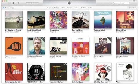
Well, it finally happened: Apple got around to fixing iTunes.
Over the years, that program had become more and more cluttered as Apple saddled it with more and more burdens. In the beginning (2001), it was meant to be nothing more than a jukebox program. Then it became the loading dock for the iPod. Then it was the front end for the iTunes Music Store online. Then it was asked to manage TV shows and movies. Then podcasts. Then e-books. Then it became the syncing headquarters for iPhones and iPads. Then it was supposed to manage apps. Then it was the front end for Ping, Apple’s flopped music-discussion service.
Eventually, it became a sluggish, cluttered, spreadsheety hangnail on our digital lives.
On Friday, Apple introduced the free iTunes 11 for download (Mac and Windows). It’s still the front end for music, videos and iGadgets, and its features and personality are much the same. But the design has been overhauled — deeply, controversially, but, in general, successfully.
You’ll probably notice the declutterization first, what Apple calls “edge-to-edge” design. There’s nothing on the right, left or bottom borders: the entire window is filled with album covers, or song lists, or whatever view you’ve selected in the bar across the top.
You can restore the left-side list of sources and the bottom-edge status bar if you miss them. But the proposed setup works fine: You choose the file type from the top-left pop-up menu (Music, Movies, TV Shows, Books, Podcasts, Apps), then click a category button across the top to change the display (like Songs, Albums or Artists.).
Each of those criteria (Songs, Albums…) has its own layout now. The Album view is especially cool. You see a grid of your album covers; when you click one, an information strip appears beneath, listing the songs. The strip is color-coded to the dominant color of the album cover itself. Slick.
Little buttons with “” on them appear on just about everything; each produces a pop-up menu of options for that song, album or video (Add to Playlist, for example, or Show in iTunes Store).
A great new feature called Up Next is a list of songs that iTunes intends to play next — because they’re in a playlist you made, or they’re part of an album, or iTunes’s Genius feature is lining them up like a robot D.J., or just because you feel like building an on-the-fly playlist. You can delete the ones you don’t want to play, drag new songs into the lineup or reorder the songs that are there.
You can now redeem iTunes gift cards without having to type in that 723-digit code number. Just hold the bar code up to your computer’s Webcam; iTunes does the rest.
Apple also fixed some of the dumber design elements that have always plagued iTunes. For years, the store was represented only as one item in the left-side list, lost among less important entries like Radio and Podcasts. Now a single button in the upper-right corner switches between iTunes’s two personalities: Store (meaning Apple’s stuff) and Library (meaning your stuff).
And you know those three round buttons in the upper-left corner of the window? They’re supposed to mean Close, Minimize and Maximize. But the green one, for years, didn’t maximize the window — it shrank the window to a miniplayer, in frustrating violation of Apple’s own design guidelines.
Not anymore. Now the green button does what it’s supposed to — makes iTunes fill your screen — and a new Miniplayer button opens a new, better floating Miniplayer window.
The miniplayer offers far more power now. You can search your entire library, switch to a different song or playlist and manipulate the Up Next list, without ever having to jump back to the full iTunes window. At last, you can park the miniplayer in a corner of your screen as you do other work, while still flinging new songs into the lineup.
Unfortunately, Apple hasn’t fixed the Search box. As before, you can’t specify in advance what you’re looking for: an app, a song, a TV show, a book. Whatever you type into the Search box finds everything that matches, and you can’t filter it until after you search. It feels like a two-step process when one should do.
And then, of course, there’s the eternal question: “Is iTunes doing too much?”
Sometimes, there’s synergy. Sometimes, it seems to make sense that the jukebox, video, store and iGadget-loading features are all mashed into a single program — but not always. Sometimes, you feel like you’re using separate, grafted-together programs.
In many ways, iTunes 11 is a classic Apple move. It replaces something you knew with something that Apple considers better — with little regard to the time it will take you to learn where everything went. Online, there’s already a lot of “Noooo! They eliminated feature X!” — when feature X has just been moved or demoted.
iTunes 11 is, on the whole, better than what came before it — if only because it’s faster, far less cluttered and laid out more sensibly. Yes, change always ruffles people’s feathers — you could argue that Apple’s specialty is feather-ruffling — but this time, at least, the overall direction is up.
Article source: http://pogue.blogs.nytimes.com/2012/11/30/apple-rolls-out-a-cleaner-itunes/?partner=rss&emc=rss
Speak Your Mind
You must be logged in to post a comment.