Uwe E. Reinhardt is an economics professor at Princeton. He has some financial interests in the health care field.
From time to time I stand accused of injecting humor into my public presentations on health policy in the United States. As a German-born economist, I find it hurtful.
Today’s Economist
Perspectives from expert contributors.
Germans pride themselves on their lack of humor. Economists, for their part, pride themselves on being practitioners of the dismal science. We are the professional buzzkills who put caveats on any good news.
Now imagine both traits packaged into one human being: you have yours truly. It is not that I inject humor into our otherwise august debate on health policy. Rather, the health system in the United States is in many ways so risible that it comes across as droll even when a dour German-born economist describes it.
One of those risible moments occurred this week when the Centers for Medicare and Medicaid Services of the Department of Health and Human Services delivered a giant spreadsheet on hospital charges and payments.
The spreadsheet has data in 65,536 rows and 12 columns. It covers, for each of more than 3,000 hospitals, charges and payments for the 100 most frequently billed inpatient cases, along with the average covered charges hypothetically billed by those hospitals for those cases.
The distribution of this giant spreadsheet instantly brought headlines in major daily publications, telling the world that billing charges for a given case vary widely among hospitals even within one city.
Really?
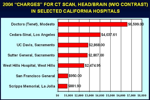
Why was this news? That charges vary enormously among hospitals surely must have been known for many years. As early as 2004, for example, Lucette Lagnado of The Wall Street Journal reported that on the paper’s front page.
I recall producing from her data, for a 2006 paper, “The Pricing of U.S. Hospital Services: Chaos Behind a Veil of Secrecy,” the following slide. More such wondrous charges can be found in Ms. Lagnado’s article.

Readers of this blog may recall several posts on the pricing of hospital services, commenting on such variations.
Perhaps the news in this case was that at long last the government had bestirred itself to publish data on which it had been sitting for decades. Indeed, why it had not done so eons ago is an intriguing question.
Part of the data in the government’s daunting spreadsheet could potentially be useful to prospective paying patients. The other part is useful mainly as a source of humor.
What Medicare Actually Pays: For each hospital listed in the spreadsheet, the Centers for Medicare and Medicaid Services show in Column K the average case payments that Medicare actually made to that hospital in 2011 for the 100 most frequently billed cases in the government’s “medical severity-adjusted diagnosis-related grouping,” known as MS-DRG, a classification of inpatient cases. These actual payments are the total payments the hospital received for the case not only from Medicare itself but from patients in the form of co-payments, or from third parties, such as Medigap insurers that cover co-payments otherwise due from patients.
I described an excellent synopsis of Medicare’s MS-DRG classification system and how it sets the payment rate per MS-DRG case in an earlier post.
In principle, patients paying out of pocket could use the actual Medicare payment for an MS-DRG rate as benchmarks by which to gauge the reasonableness of whatever a hospital may charge them for that type of case.
For example, in Column K of Row 28,067 of the spreadsheet, readers learn that for MS-DRG 249 “Perc Cardiovasc Proc W Non-Drug-Eluting Stent w/o MCC” Medicare paid North Shore Medical Center in Miami an average case payment of $13,301 in 2011.
If a paying patient treated or to be treated at North Shore Medical Center can understand the sometimes arcane case descriptions listed in Column A of the spreadsheet, this information might be helpful in haggling with the hospital over its detailed bill before or even after the procedure.
From Column J, Row 28,067 of the spreadsheet, the patient also learns that North Shore Medical Center’s average covered charges for MS-DRG 249 came to $99,275, or 7.5 times what Medicare pays.
So what have we here? What are these charges?
In a handsome graphic comparing Medicare reimbursement (the actual Medicare payment) with average covered charges, a Washington Post blog post described the latter as “average cost.” But costs is exactly not what these “average charges” reflect.
“Average charges” in the United States hospital business are pure fiction — and a funny fiction, at that. They are simply list prices few patients ever pay. Indeed, if any hospital in the United States ever were paid its charges for every patient, its profits would be truly embarrassing.
To appreciate why, it may be helpful to say a word about the so-called chargemasters of hospitals.
Average Covered Charges: Under the tab “Documentation” in the Excel workbook, the Centers for Medicare and Medicaid Services define “average covered charges” as “the provider’s average charge for services covered by Medicare for all discharges in the DRG. These will vary from hospital to hospital because of differences in hospital charge structures.”
In composing a bill for an inpatient case, a hospital’s computers find the charge for a particular service, procedure or manufactured good in the hospital’s huge chargemaster. The latter is a detailed listing of the hospital’s list prices for myriad procedures and products.
Under the mantra that rules American health care, that “one size does not fit all” — this, in a country that invented one-size-fits-all franchising like McDonald’s and Holiday Inn — the structure and detail of chargemasters are hospital-specific and vary considerably among hospitals. In a detailed study in 2005, the consulting firm Lewin Group noted that hospital chargemasters may contain anywhere from 12,000 to 45,000 distinct items, depending on the hospital.
To see a live example of such a chargemaster and to appreciate how useless its contents would be to a lay person, readers may wish to consult the 2012 chargemaster of Dameron Hospital in Stockton, Calif. I chose it because it happened to pop up in a Google search.
Hospitals update their chargemasters continuously, under the overall supervision of the hospital’s chief financial officer and often with the help of outside consultants.
Here is how, in 2004, the chief financial officer of California’s UC Davis Health System, a 30-year veteran of hospital financing, described this process of updating to The Wall Street Journal:
There is no method to this madness. As we went through the years, we had these cockamamie formulas. We multiplied our costs to set our charges.
Even a German-born economist cannot suppress a smirk at this amazing feature of American health care, a feature whose production engages so many deadly serious adults, including an armada of deadly serious outside consultants.
Even funnier are the protestations by hospital executives that hardly anyone ever pays these fictional prices, which prompted me to offer the following technical definition: “ ‘Charges’ are the prices that a totally inebriated foreign billionaire would pay a U.S. hospital if his wife were not around to control the bloke.”
While it may be true that hardly anyone ever pays these hospital charges, Steven Brill reported not long ago that some and perhaps many hospitals actually bill uninsured American patients with some means and then hound them for payment. That, of course, is not funny.
In the end, though, it is not at all clear to me why anyone should care about the fictitious “average covered charge” figures reported by the Medicare agency. What exactly is a prospective patient to do with this metric?
Nor is it clear to me what all the excitement in the news media was about.
It just made this dour German-born economist laugh out loud once again.
Article source: http://economix.blogs.nytimes.com/2013/05/10/american-health-care-as-a-source-of-humor/?partner=rss&emc=rss