CATHERINE RAMPELL
Dollars to doughnuts.
For a while I was regularly updating a chart each month showing how far employment plummeted in the latest recession and how little ground has been recovered since the recovery began in June 2009. Compared with other recent recessions and recoveries, the last few years have looked especially disastrous:
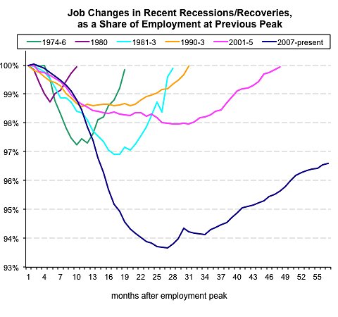 Source: Bureau of Labor Statistics
But that may be the wrong comparison to make.
As the Harvard economists Carmen Reinhart and Kenneth Rogoff have written, financial crises are always especially disastrous. Over the course of a dozen financial crises in developed and developing countries going back to the Great Depression, the unemployment rate rose an average of 7 percentage points over 4.8 years, they found.
And actually, when shown alongside the track records of other financial crises, the American job losses caused by the recent financial crisis don’t look quite as horrifying:
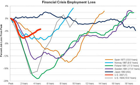 Courtesy of Josh Lehner.
The chart above was put together by Josh Lehner, an economist for the state of Oregon. The red line shows the change in employment since December 2007, when the most recent recession officially began.
As you can see, drastic as American job losses have been in recent years, they were far worse and lasted much longer in the aftermath of the financial crises that struck, for example, Finland and Sweden in 1991 and Spain in 1977, not to mention the United States during the Great Depression.
Looking at unemployment rates (which refer to the share of people who want to work but can’t find jobs, as opposed to just the total number of jobs) also shows that things in the United States could have been much worse:
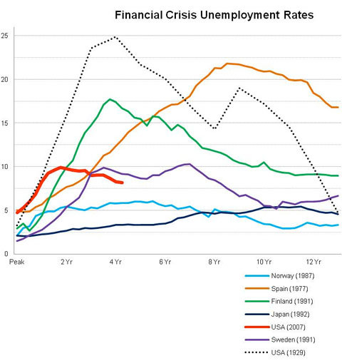 Courtesy of Josh Lehner.
In the United States, the unemployment rate rose from an average of 4.5 percent in the year before the crisis to a peak of 10 percent. In other words, the jobless rate more than doubled. After previous financial crises, however, some countries saw their unemployment rates triple, quadruple, even quintuple.
It’s not clear why the United States came out of this financial crisis relatively less scathed than history might predict.
Mr. Lehner attributes this to “the coordinated global response to the immediate crises in late 2008 and early 2009,” referring to both monetary and fiscal stimulus. He notes that the United States and the global economy had been tracking the path of the Great Depression in 2008-9, until we saw a number of major government interventions kick in.
Article source: http://economix.blogs.nytimes.com/2012/09/25/comparing-the-job-losses-in-financial-crises/?partner=rss&emc=rss