April 25, 2024

Economix Blog: In New York City, Cheaper (and Later) Pedicures

CATHERINE RAMPELL

CATHERINE RAMPELL

Dollars to doughnuts.

I have written a column for The New York Times Magazine about the cost of living in New York, which is actually relatively cheap if you’re wealthy and have standard wealthy-person tastes. It was based largely on research by Jessie Handbury, an economics professor at the Wharton School at the University of Pennsylvania, which looked at the groceries that rich versus poor people buy, and how much those different bundles of groceries cost in rich versus poor cities.

In a high-income city like New York, grocery costs are 20 percent lower for high-income people than they are in a low-income city like New Orleans (whereas costs are about 20 percent higher for low-income people in the rich city than the poor city). That’s because there’s a very high concentration of highly skilled people here, so there are a lot of vendors competing for the business of those high-income people, effectively lowering costs and increasing the variety of products that appeal to this consumer group.

Professor Handbury looked specifically at food, but she said that for most things you buy, there are probably positive externalities that come from living around a lot of people who have tastes similar to yours.

“The results are generalizable to other products that have increasing returns to scale and where we think there’s differentiated demand across income types,” she said. “That pretty much holds up, I think, up to housing. You don’t have increasing returns to scale with housing, because you have such an inelastic supply there.” (“Inelastic supply” means that supply can’t adjust easily in response to changes in price; I’ll have more about New York housing costs in a subsequent blog post.)

I was interested to see whether prices of other, relatively supply-elastic services that cater to high-income people are cheaper here than they are elsewhere. Getting local pricing data along these lines is difficult, though, since the usual cost-of-living measures are based on the basket of goods that the typical consumer purchases, not the high-income consumer.

Fortunately I came across Centzy, a company that is compiling pricing and hours data for local businesses as part of a search engine service.

Centzy’s co-founder and chief executive, Jay Shek, said that the company defined a taxonomy of businesses that they want to cover and the information they want to know about each. Then they purchased phone-book listings (just as companies like Yelp and Google do) for these businesses. At any given time Centzy employs 40 to 100 people, mostly in low-cost places like India and the Philippines, to cold-call companies and ask about pricing and availability for a standard menu of services. The listings data are imperfect; Mr. Shek says about 15 percent of listings the team dials each month are out of date, miscategorized or otherwise unreachable, and that a Centzy representative will generally call up to four times during standard business hours before giving up on a company’s existence. Because of errors in the listings data, it’s hard to know exactly what share of local businesses Centzy has data for. Mr. Shek notes, though, that they use the same methodology for every city, so it seems unlikely that their numbers would show any bias toward any particular city.

Centzy currently has information on the prices and hours at 400,000 local businesses in the top 10 United States metropolitan areas, with better coverage for beauty services and spottier coverage for less-commodifiable services, like yoga classes (whose prices are hard to standardize, because sometimes yoga studios and gyms charge by the class, the monthly membership, or some other package deal). I asked Centzy to compile data for me on the prices and hours for some beauty services that probably disproportionately cater to high-end clients.

Here are the prices for manicures (just standard, regular manicures, not including acrylic or shellac) and pedicures in New York versus other cities:

For these services, at least, the average price was cheaper in New York than in the other cities (although there was of course a range of prices within cities).

Another service I asked Centzy about, massages, showed New York prices to be about in line with those in other cities, and even a few cents more expensive. Based on a thoroughly nonscientific survey of my more spa-going friends, though, I am told that there is probably more heterogeneity in both quality and variety among massages than in manicures and pedicures. So it may be harder to compare the average price for this service across cities if the composition of the massages offered is different (which it probably is, given different tastes and income levels in each place).

One way in which New York definitely seems to offer rich people a better deal on these services, though, is in hourly availability.

You know that whole “city that never sleeps” reputation? Well, it shows up at salons and spas. Here are the total average weekly hours for businesses in each of the top 10 cities that sell these services (and note that there is substantial overlap between businesses selling manicures and those selling pedicures, so the hours are pretty similar):

As you can see, salons and spas have much longer hours here. In New York, about one in 10 (10.5 percent) of salons will sell you a pedicure at 9 p.m., according to Centzy’s data; in the other cities, fewer than one in 100 salons will be open at that time (unweighted average of 0.5 percent).

Greater availability at more hours effectively lowers prices for the people who consume these services. That’s because economists don’t think about prices just as the sticker price of goods or services, but rather how consumers prefer an entire bundle of goods over another, based on what we observe about their purchasing choices. (Economists like to measure the cost of different things people consume in terms of price per util, an economic measure of happiness.)

Restaurants might be a bit more expensive here, but they offer more variety, are open much later, and nearly all of them deliver. And more highly skilled people consume those varied, late-night deliveries, which they could not get at any price in a lower-skill city like Detroit. Similarly, people in New York have the choice to get a pedicure at noon, but often enough they choose the 9 p.m. one — hence we assume they prefer it (maybe because they want to work late, get drinks with friends, or some other reason). Let’s say we moved a customer who usually gets her pedicures at 9 p.m. from New York to Houston, where just 0.2 percent of salons are open at 9 p.m. In her new locale, she wouldn’t be able to get her desired service at the time she wants it, even if she were willing to pay a lot more for it, since there aren’t currently enough customers like her in Houston to support staying open that late.

Those kinds of trade-offs in quality and availability represent costs to consumers that may not be obvious in just the sticker price of a good or service.

Article source: http://economix.blogs.nytimes.com/2013/04/23/in-new-york-city-cheaper-and-later-pedicures/?partner=rss&emc=rss

Today’s Economist: Uwe E. Reinhardt: Health Care as an Economic Stabilizer

DESCRIPTION

Uwe E. Reinhardt is an economics professor at Princeton. He has some financial interests in the health care field.

It has become customary to see our health care sector as a burden on society. In some ways it is. We have developed a complicated system of financing the sector – one guaranteed to put stress on the budgets of many households and governments at all levels.

Today’s Economist

Perspectives from expert contributors.

Furthermore, we have structured the system so that prices for virtually any kind of health care in the United States are at least twice as high as prices for the same things in other countries. It is the main reason that health spending per capita in the United States is about double what most other nations spend. (Earlier this week, the Congressional Budget Office reported a sharp slowdown in the growth of health care costs, leaving budget experts trying to figure out whether the trend will last and how much the slower growth could help alleviate the country’s long-term fiscal problems.)

From a macroeconomic perspective, the health care sector has functioned for some time as the main economic locomotive pulling the economy along. In the last two decades, it has created more jobs on a net basis than any other sector.

Oddly, not much is made of the job-creating ability of the health care sector in political debate over health policy, in contrast to discussions of military spending, where employment always ranks high among the arguments against cuts. In October 2011, for example, Representative Buck McKeon of California, the chairman of the House Armed Services Committee, made that point, among others, in a commentary in The Wall Street Journal, “Why Defense Cuts Don’t Make Sense”:

And on the economic front, if the super committee fails to reach an agreement, its automatic cuts would kill upwards of 800,000 active-duty, civilian and industrial American jobs. This would inflate our unemployment rate by a full percentage point, close shipyards and assembly lines, and damage the industrial base that our war fighters need to stay fully supplied and equipped.


Not surprisingly, in its “Defense Spending Cuts: The Impact on Economic Activity and Jobs,” the National Association of Manufacturers makes the same point.

For what it is worth, economists do not view “job creation” as an industry’s valuable output. Instead, when Industry A creates jobs and with them additional output, economists ask where the workers filling these jobs would have worked instead and whether the value of their output there would be smaller or larger than the output they produce in Industry A.

But health care has one additional feature I stumbled upon while writing a recent paper: from a macroeconomic perspective, it serves as an automatic stabilizer that offsets fluctuations in the growth of gross domestic product. Corporate and personal taxes and transfer payments such as unemployment benefits or additional enrollment in Medicaid are classic forms. They actually change countercyclically with changes in G.D.P., but health spending levels remain fairly stable as G.D.P. fluctuates.

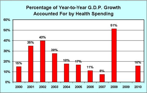
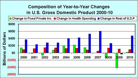
The chart below presents the year-to-year changes in total national health spending, in total private fixed investments and in the rest of the G.D.P. from 2000 to 2010. The second chart depicts the fraction of year-to-year changes in G.D.P. accounted for by year-to-year changes in national health spending, a component of G.D.P. In that chart, no column is shown for 2009, because from 2008 to 2009 private investment plummeted by $421 billion and total G.D.P. fell by $353 billion, while health spending rose by $107 billion.

The health spending data in these charts comes from Table 1 of the Centers for Medicare and Medicaid Services publication “National Health Expenditures,” which provides national health spending data for the years plotted in the graph. The data on G.D.P. and fixed private investments come from the President’s Economic Report 2012, Tables B-1 and B-18.

It can be seen that total private investment fluctuates considerably over booms and busts. By contrast, health care spending remains fairly stable over time. It does tend to growth less rapidly in times of deep recessions, but it has not declined in the United States.

The next chart depicts the fraction of year-to-year changes in G.D.P. that is accounted for by year-to-year changes in national health spending, a component of G.D.P. In that chart, no column is shown for 2009, because from 2008 to 2009 private investment plummeted by $421 billion and total G.D.P. fell by $353 billion while health spending rose by $107 billion.

One must wonder what would have happened in the presidential elections of 2004 and 2012 if health care had not buoyed G.D.P. in the recession of 2000-1 and the recession that began in 2008.

One does not have to be a blind devotee of the Yale economist Ray Fair’s economic model of presidential elections, which relies on only a few variables to predict vote shares, to believe that one or both elections might have had different outcomes, even though both Presidents Bush and Obama inherited the recessions over which they presided.

Article source: http://economix.blogs.nytimes.com/2013/02/15/health-care-as-an-economic-stabilizer/?partner=rss&emc=rss

Today’s Economist: Nancy Folbre: Work in the Walmartocene

Nancy Folbre, economist at the University of Massachusetts, Amherst.

Nancy Folbre is an economics professor at the University of Massachusetts, Amherst. She recently edited and contributed to “For Love and Money: Care Provision in the United States.

Some scientists contend that we should label the era we live in the Anthropocene, because we humans (anthropoi) have fundamentally altered our global ecosystem. Economists might, for similar reasons, consider labeling the current economic era the Walmartocene.

Today’s Economist

Perspectives from expert contributors.

The world’s largest retail company (and second-largest business), having easily survived recent skirmishes with workers, shareholders and the law, just announced that it would virtually guarantee jobs to most recent American veterans, who currently suffer from higher-than-average unemployment rates.

In some ways, Walmart represents the archetype of modern capitalism. It is Tyrannosaurus rex. It pioneers cost-saving methods of global outsourcing and resistance to unionization. It leaps national borders in a single bound. It generates huge profits for its shareholders by delivering a gazillion goods to consumers around the world at prices that few other big-box stores – much less small retail businesses – match.

Many of its regular shoppers adore it. Many of its workers, on the other hand, feel underpaid and underappreciated, and have filed numerous suits, accusing it of violations of labor law, including failure to pay overtime, locking workers in stores overnight, union-busting and sex discrimination. The details of the company’s bribery of Mexican officials, in a successful effort to bypass community opposition to store construction in proximity to a historic site, proved particularly embarrassing to its shareholders.

Walmart has long had a love-hate relationship with the American public. But the hate has become more visible in recent years, and the company has made active efforts to abate it.

Before announcing its most recent veteran-hiring initiative, it had thrown its considerable weight behind locally grown organic food and green energy initiatives, pursuing themes that seem intended to win approval from the Obama White House.

These efforts may represent nothing more than cost-effective investments in public relations. But they may also reflect the values of a new generation of Walton family members.

In terms of ownership and management, Walmart is not a classic capitalist company owned by shareholders buying and selling purely on the basis of price per share. It is a family operation, largely controlled by the Walton family, which keeps a tight hand on management.

Although the founder Sam Walton was an entrepreneur, succeeding generations represent a kind of feudal dynasty, largely based on inherited wealth.

Analysis of data from the Survey of Consumer Finances indicates that, in 2010, the Walton family controlled assets equivalent to those of the bottom 42 percent of American families.

This Arkansas aristocracy may feel a certain noblesse oblige. Offering to give jobs to all veterans honorably discharged on or after the plan’s announcement on Jan.15 is a patriotic gesture, even if it is sweetened by substantial tax credits.

The company values loyalty and its hierarchical management structure may look familiar to men and women who have participated in the armed forces.

However, most veterans taking up Walmart’s offer will have to tighten their belts. An Army private first class, with four years’ experience, earns a base pay of $24,178. The average active-duty service member receives a total benefits and pay compensation package worth $99,000 a year, because of substantial in-kind benefits in the form of housing, health care and food.

The average wage for a full-time hourly Walmart associate in the United States is $12.57, which adds up to $26,108 a year at 40 hours a week. But the primary benefits Walmart offers are slim: a health-insurance plan with high deductibles that workers can choose to sign on and contribute to, and a 10 percent discount on store purchases. As a result, Walmart workers make more use of public health and welfare programs, such as food stamps and Medicaid, than other retail workers.

Opportunities for promotion and annual raises are rather limited.

The new hiring policy may increase the proportion of men working the Walmart aisles, because veterans are predominantly men. On the other hand, female veterans may be more likely to apply for jobs in retailing.

Some of these women, bruised by a “brass ceiling” based on their exclusion from combat roles, may prove rather feisty when they learn of continuing class-action suits against Walmart, accusing it of restricting women’s access to management positions. Some may be heartened, however, by Walmart’s recent efforts to increase women’s representation on its board and to promote women’s businesses.

One could argue that efforts to shame Walmart have paid off. But it seems unlikely that the United States economy would look much different if Walmart had been slightly better behaved all along. The company itself is the product of increasingly global competition that has increased the scale of business enterprise, concentrated the ownership of wealth and weakened democratic governance.

In the Walmartocene Era of declining opportunities for American workers, some veterans may feel that even the promised entry-level jobs are worth fighting for.

Article source: http://economix.blogs.nytimes.com/2013/01/21/work-in-the-walmartocene/?partner=rss&emc=rss

Economix Blog: Casey B. Mulligan: Tax Exclusions for Health Insurance

DESCRIPTION

Casey B. Mulligan is an economics professor at the University of Chicago. He is the author of “The Redistribution Recession: How Labor Market Distortions Contracted the Economy.”

The magnitude and distributional effects of the tax exclusion for health insurance look quite different when viewed from the perspective of the entire safety net.

Today’s Economist

Perspectives from expert contributors.

Expenditures on health services, especially those made through employer-sponsored health-insurance plans, are largely excluded from a host of taxes. The tax exclusions affect both the size of the health-services sector and society’s distribution of disposable income.

By excluding health services from tax, governments in effect redirect money toward health care and away from other activities that might be subsidized or prevent government from reducing overall tax rates, or both. The tax exclusions therefore have a lot in common with direct government spending on health, and for this reason are often described as “tax expenditures.”

A typical approach to estimating the size of the health subsidy implicit in the tax exclusions is to estimate the amount of federal personal income tax revenue that is lost because of the income that escapes tax. It’s important to know the amount of the implicit subsidy, because it is directly related to the amount by which the health sector is enlarged by public policy.

However, the income-tax approach underestimates the amount of the exclusion, because health services are often excluded from many other taxes. The payroll tax is an important instance: employer-provided health-insurance premiums are exempt from payroll and state personal income taxes, too, regardless of whether the employer or employee pays them.

Health-insurance premiums paid by employers on behalf of their employees will escape pretty much anything that taxes an employee’s wages and salaries, because those premiums are not officially considered part of employee wages or salaries. For example, the food-stamp program and Section 8 housing subsidy programs implicitly tax wages and salaries by withholding benefits according to how much a person earns, but for that purpose they ignore employee fringe benefits like health insurance.

Health goods and services often escape state sales taxes, depending on the type of good or service delivered or the type of organization delivering it. Many health services are delivered by nonprofit institutions that escape corporate income and property taxes, too. Just as with the housing industry, we vastly underestimate the government’s effect on the health industry if we focus only on the income tax.

A good summary statistic for the overall effect of tax exclusions on the health industry would be a measure of the marginal tax rate on earned income that included all the relevant taxes. When an employee accepts a $1 pay cut so that his employer can add that dollar to his health insurance contribution, that overall marginal tax rate would tell us how much of that dollar comes back to the employee in the form of the various tax reductions.

I am not aware of a marginal tax-rate measure comprehensive enough for this purpose (it would also need to pay special attention to the Medicaid program and its different treatment of adults and children), but previous studies have taken some useful steps in this direction. The studies find marginal tax rates greater than 50 percent for families above but near the poverty line, which means most of the money they might devote to employer-provided health insurance would come back to them in terms of reduced taxes and enhanced benefits.

More study is needed to quantify accurately the government’s effect on the health market. But we can be sure that public policy has served to enlarge the health industry at the expense of others and that previous estimates do not fully appreciate the magnitude of the distortion.

Article source: http://economix.blogs.nytimes.com/2013/01/16/tax-exclusions-for-health-insurance/?partner=rss&emc=rss

Today’s Economist: Casey B. Mulligan: What Job Openings Tell Us

DESCRIPTION

Casey B. Mulligan is an economics professor at the University of Chicago. He is the author of “The Redistribution Recession: How Labor Market Distortions Contracted the Economy.”

A high ratio of unemployed to job openings means that the unemployed are competing a lot for jobs, many news reports say, when in fact it could indicate the opposite.

Today’s Economist

Perspectives from expert contributors.

It’s true that a reduction in labor demand — from, say, a new tax on employers — would motivate employers to get by with fewer employees. As they do, employers would reduce job openings and lay off workers. One result would be fewer job openings and more unemployed people, and thereby more unemployed people per job opening.

But a reduction in labor supply in the form of additional subsidies for unemployed people would have similar effects. Unemployed people would be choosier about the jobs they accept, especially the low-wage ones. With more help for people after layoffs, employers and employees in struggling industries would do less to avoid layoffs, especially layoffs from low-paying positions. Either way the result would be more unemployed people.

Subsidies for unemployed people also make labor more expensive as low-wage jobs are more likely to end by layoff and unemployed people can be choosier about the jobs they take. When labor is more expensive, employers have an incentive to get by with fewer employees and for that reason may well reduce the number of job openings they have.

In this way a reduction in labor supply by itself, a reduction in labor demand by itself or both together can increase the ratio of unemployed to job openings. It makes little sense to point to a high ratio as proof that labor demand is low, because it could just as easily tell us that labor supply is low. All a high ratio tells us is that the labor market has contracted, and that we could readily and more reliably detect without any data on job openings by just looking at the unemployment rate itself, or the ratio of employed to population.

My conclusion is not new to labor economists, who have long understood that supply factors could increase the ratio of unemployed to job openings. Christopher A. Pissarides, a professor at the London School of Economics, literally wrote the book on job openings and unemployment, and his book explains how more generous unemployment compensation would have these effects (see Figure 9.2 from his latest edition; I thank my colleague Robert Shimer for this reference).

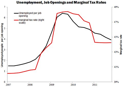
The black series in the chart below shows the ratio of unemployed to job openings. The chart also shows in red the marginal tax rate on labor income (the extra taxes paid, and subsidies forgone, as a result of working, expressed as a ratio to the income from working) for a typical head of household or spouse based on the ever-changing eligibility and benefit rules for safety-net programs. The ratio increases fastest between the first half of 2008 and the first half of 2009, just when the marginal tax rate series increases the most. Both series peak in late 2010 and decline thereafter. Neither series has returned to its prerecession level.

Ratio of unemployed per job opening is calculated from Bureau of Labor Statistics seasonally adjusted monthly figures for number of unemployed and total nonfarm job openings, as provided by the St. Louis Fed. Marginal tax rates are as calculated by Casey B. Mulligan in Ratio of unemployed per job opening is calculated from Bureau of Labor Statistics seasonally adjusted monthly figures for number of unemployed and total nonfarm job openings, as provided by the St. Louis Fed. Marginal tax rates are as calculated by Casey B. Mulligan in “The Redistribution Recession” (Oxford University Press, 2012).

For the reasons mentioned above, the chart is by no means proof that supply was a major factor during the recession. That proof requires other sorts of analyses, which are shown in my book.

Nevertheless Paul Krugman continues to cite the high ratio of unemployed to job openings as evidence that demand, rather than supply, contracted the labor market: “There are now four job seekers for every job opening, which means that workers who lose one job find it very hard to get another” (see Page 9 of “End This Depression Now!”). He and other economics commentators citing this fact never explain why the very same ratio should not be interpreted as a drop in supply, or as a combination of reduced supply and reduced demand. Instead they contend that the labor market would rebound with still more help for the unemployed.

Believe it or not, Keynesian economics is not the only way to interpret the job openings data.

Article source: http://economix.blogs.nytimes.com/2012/11/14/what-job-openings-tell-us/?partner=rss&emc=rss

Today’s Economist: Casey B. Mulligan: The Rise and Fall of Wages

DESCRIPTION

Casey B. Mulligan is an economics professor at the University of Chicago.

Aggregate wage-rate data show no sign of the huge and prolonged demand shock said to have hit the economy in 2008. Instead, they bear the fingerprints of an expanded social-safety net.

Today’s Economist

Perspectives from expert contributors.

A conventional narrative of the American labor market since 2007 is that the demand for labor collapsed, so that despite a uniformly willing and eager work force, millions of people had to go without jobs. This narrative is an aggregate theory and not primarily about sectoral shifts that would depress demand for some types of labor and increase it for others. If this narrative is accurate, it should be visible in aggregate wage-rate data.

At a minimum, the aggregate demand collapse should have frozen wage rates in dollar terms, so that inflation-adjusted wages would erode with inflation as consumer prices crept up. With the price index for consumer items 8 percent higher at the end of 2011 than it was when the recession began, inflation-adjusted hourly wages should have fallen at least 8 percent over that time frame, if not more.

In my view, the change in aggregate demand has been heavily exaggerated, and the greater impulse affecting the labor market over the last five years has been higher marginal tax rates created by an expanding social safety net of unemployment insurance, food stamps, Medicare and other anti-poverty programs. Those tax rates, as I noted last week, refer “to the extra taxes paid, and subsidies forgone, as a result of working, expressed as a ratio to the income from working.”

I expected real wage rates (and hourly labor productivity) to rise in the short term, and to do so a couple of percentage points above the previous upward trend made possible by continuing progress of the productivity of labor and capital.

Marginal tax rates increase real wage rates a few percentage points in the short term because, with more help during unemployment, employees at struggling businesses have less reason to make some of the concessions in wages and working conditions that can help the employer to retain employees affordably.

As I explain in “The Redistribution Recession,” wage rates would quickly fall back toward the trend line when some of the temporary safety-net measures began to expire, which was two or three years after the recession began.

Those safety-net expansions that were permanent would eventually reduce average real wage rates, as people out of work reduced their human capital investment. This reduction might reflect people who, because they no longer practice a trade, lose contacts in the workplace or no longer maintain a wardrobe or tools they need for work. (For more on this effect, see especially the literature on women’s wage trends.) Unfortunately, these wage reductions do not encourage employers to hire because they derive from reductions in productivity.

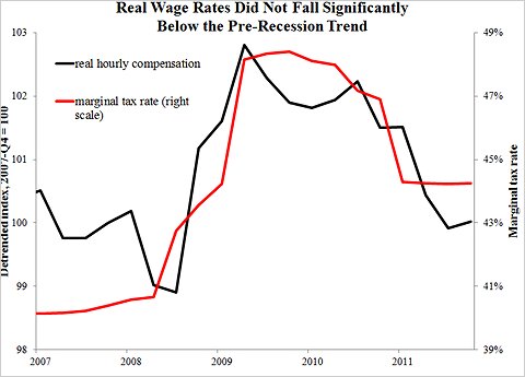
The black series in Chart 1 below shows aggregate real wage rates measured as inflation-adjusted employee compensation (including fringe benefits like health insurance) per hour worked. I have removed an upward trend, because for short-run analysis it is interesting to look at deviations from trends. Under normal conditions real wages can increase with productivity even while the amount of labor is neither rising nor falling.

The trend adjustment is 0.5 percent a year, based on the average rate of growth of total factor productivity during the four years before the recession. Without the trend adjustment, the black series would increase two percentage points more through 2011 than shown.The trend adjustment is 0.5 percent a year, based on the average rate of growth of total factor productivity during the four years before the recession. Without the trend adjustment, the black series would increase two percentage points more through 2011 than shown.

The chart also shows in red the marginal tax rate on labor income measured in my book for a typical household head or spouse based on the ever-changing eligibility and benefit rules for safety-net programs. Sure enough, real hourly compensation increased during the recession and did so about a quarter after marginal tax rates began their increase.

Marginal tax rates were high and fairly flat during 2009 and early 2010 as the “stimulus” law was in full force. During this time, real wages failed to fall back anywhere close to their prerecession values. Only when some of the stimulus provisions began to expire, reflected in a marginal tax rate that falls to 44 or 45 percent from 48 percent, did real wage rates decline quickly and significantly.

Even after the decline in late 2010 and early 2011, it looks as though real wage rates are about where the previous trend line was, rather than being the several percentage points below what one might expect after a huge, prolonged demand shock.

A few economists have used Census Bureau wage data, which ignore the fringe benefits from employment, to show that wages fell during 2010 and 2011. It is incorrect to ignore fringe benefits (I discuss this and other wage measurement issues in Chapter 2 of “The Redistribution Recession”), but the choice of series is just a quibble, because none of the aggregate wage measures display a cumulative decline that would be commensurate with the huge, prolonged demand collapse said to have occurred.

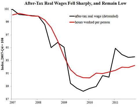
A magnifying glass is not required to see a decline in after-tax real wage rates. The after-tax real wage rate (calculated as the product of real hourly compensation and one minus the marginal tax rate) shown in black in Chart 2 reflects the net financial reward per hour of working, taking into account taxes and safety-net subsidies.

TKTKTKTKThe after-tax real wage series has been adjusted for a trend of 0.5 percent a year.

Marginal tax-rate changes, such as those created by an expanding social safety net, cause deviations between the real hourly compensation shown in Chart 1 and the after-tax series shown in Chart 2. In theory, the downward marginal tax rate effect on after-tax real wages exceeds the upward effect on real hourly compensation.

In fact, after-tax real wages fell a startling 12 percent below the trend line during the first two years of the recession (note that each tick in Chart 2 is twice as large as each tick in Chart 1). They rebounded somewhat as marginal tax rates came off their stimulus highs but still remain six or seven percentage points below the trend line.

The quantity of labor — hours worked per capita including zeros for people not working – is shown as a red series in Chart 2. Remarkably, labor and after-tax real wage rates collapse together, hit bottom together and exhibit a partial recovery together.

Helping the poor and unemployed is intrinsically valuable, but is not free. It has made labor more expensive and depresses employment.

Article source: http://economix.blogs.nytimes.com/2012/10/03/the-rise-and-fall-of-wages/?partner=rss&emc=rss

Today’s Economist: Nancy Folbre: What Romney Could Learn From the N.F.L.

Nancy Folbre, economist at the University of Massachusetts, Amherst.

Nancy Folbre is an economics professor at the University of Massachusetts, Amherst.

In a recent speech, Mitt Romney likened the election to a football game. I wonder if he has considered the merits of the National Football League’s regulatory regime.

Today’s Economist

Perspectives from expert contributors.

I became an N.F.L. fan after reading the management expert Roger Martin’s “Fixing the Game,” which explains how the league has discouraged player involvement in gambling and improved competitiveness.

All business leaders, not just the one who wants to be chief executive of the “American company” should take notice.

Plenty of management gurus have renounced the principle of maximizing shareholder value, asserting that it leads to excess emphasis on short-term profits at the expense of long-run performance.

Professor Martin makes the point particularly vividly, observing that the way we currently reward corporate C.E.O.’s is roughly equivalent to rewarding football teams for exceeding expectations rather than winning games.

Consider the New England Patriots, who were unbeaten in the 2007 season but offered gamblers little payoff, because they seldom won by more than predicted (gambling on football usually involves a “point spread,” the expected margin of victory; to determine the outcome of the bet, that number of points is added to the points scored by the underdog).

Professor Martin sees an analogy with companies like Microsoft, which reported steady increases in revenue between 2000 and 2010 but saw its share price stagnate because it was unable to surpass expectations of what its earnings would be.

Rewarding football teams for beating the point spread would give players perverse incentives to manipulate expectations rather than to win games. That’s one reason why the N.F.L. enforces strict rules against player gambling.

By contrast, corporate pay practices that give managers short-term stock options encourage them to gamble. The easiest way for them to win big is to beat the market’s expectations, rather than to deliver steady performance.

Professor Martin draws other lessons from the N.F.L., which takes particularly effective measures to ensure team competition and – as a result – creates more suspense and excitement for fans.

Hard ceilings (known as caps) on the amount of money each team is allowed to spend on player contracts make it hard for rich teams to buy their way to success. Strict revenue-sharing from national television contracts acts like a progressive tax, giving each team an equal share regardless of their market size and local broadcast audience, enabling teams in relatively small cities including Green Bay, Wis., (population about 105,000) to be competitive.

Other professional sports have similar but sometimes weaker measures. In Major League Baseball, the disparity between the rich and the not-so-rich is particularly great. The New York Yankees, Philadelphia Phillies and Boston Red Sox spend more than three times as much on players as some competitors. As the Red Sox and Phillies have demonstrated this season, money doesn’t always buy success, though in the long run, it strongly influences outcomes.

Professional sports associations often adjust game rules to help balance offense and defense. They realize that competitive teams, like small businesses, need good rules and tough referees to guarantee fair play. They also realize that the well-being of individual teams depends, in large measure, on the success of the league as a whole.

The NFL’s regulations, in particular, have contributed to professional football’s success. Professor Martin notes that the average nationally broadcast regular-season N.F.L. game attracts more television viewers than baseball’s World Series games. The collective value of N.F.L. teams is considerably higher than those of any other league, although the New York Yankees and Los Angeles Dodgers rank among the most valuable sports teams, according to Forbes.

Many Republicans are football fans. They tend to oppose government regulation almost on principle; how they feel about industries’ self-regulation — and whether it has ever worked in finance, banking or accounting — is less clear. Mitt Romney favors a rollback of rules governing financial reform and environmental protection.

Democrats generally favor stricter rules. Maybe President Obama, known for liking basketball and golf, should call the N.F.L. to his side.

Article source: http://economix.blogs.nytimes.com/2012/09/10/what-romney-could-learn-from-the-n-f-l/?partner=rss&emc=rss

Economix Blog: Nancy Folbre: The Best States to Grow Up In

Nancy Folbre, economist at the University of Massachusetts, Amherst.

Nancy Folbre is an economics professor at the University of Massachusetts, Amherst.

Newborn children can’t choose the states in which they grow up any more than they can choose the size of their parents’ bank accounts. But voters in every state choose how much to spend on public programs benefiting children, with telling results.

Today’s Economist

Perspectives from expert contributors.

The Foundation for Child Development’s new report on state-level differences in the Index of Child Well-Being – a broad quality-of-life indicator based on 25 indicators – shows enormous variation, as does another set of indicators known as Kids Count, developed by the Annie E. Casey Foundation.

In states near the top of the list, like Connecticut, New Jersey and Utah, the successes have been celebrated. States in the South and Southwest generally rank lower, with New Mexico, Mississippi, Louisiana, Nevada and Arizona at the bottom.

Those, like Newt Gingrich, who believe, that less fortunate children lack a work ethic might point to regional differences in moral character. But evidence suggests that regional differences in willingness to pay taxes, sometimes called “tax morale,” are at work.

States that rank low on the Index of Child Well-Being are those less willing to tax adults to invest in children.

Analysis of state differences by William O’Hare, Mark Mather and Genevieve Dupuis points to the positive impact of per-pupil spending on education, higher Medicaid child-eligibility thresholds and higher levels of Temporary Assistance to Needy Children benefits on child well-being.

Average public spending on children varies far more across states than spending on the elderly, who receive benefits primarily through the federal government. Higher state and local spending, in turn, often requires higher state and local tax rates.

Children can’t vote, so adults must vote for (and pay for) higher taxes on their behalf. Calculations of economic self-interest probably play a role. Parents currently raising children gain more directly from public spending on them. State policy makers know that investments in their future work force can pay off, yielding higher state income (and tax revenues) in the future.

But levels of trust and concern for others also affect willingness to pay taxes, just as they affect people’s willingness to contribute to charities or tithe to a church. Unfortunately, as the political scientist Robert Putnam asserts, racial and ethnic diversity tends to weaken social solidarity.

Children are directly affected. Research by the economists Alberto Alesina, Reza Baqir and William Easterly, among others, shows that racial and ethnic diversity tend to undermine support for public spending on education and other services at the municipal level.

Other research indicates that the causal linkages are complicated. Levels of segregation, interaction and political representation all have an impact. The political scientist Daniel Hopkins shows that a sudden change in the racial and ethnic composition of a community may have a particularly divisive effect.

But some institutions – and political jurisdictions – do a better job of coping with these stresses than others do. Professor Putnam points to the success of policies adopted by the United States armed forces to bring recruits together and build their trust for one another.

As a previous Foundation for Child Development report by Donald Hernandez and Suzanne E. Macartney emphasizes, immigrant children in the United States are geographically concentrated in a few states where they remain economically and socially vulnerable. The new analysis of state differences shows that African-American and Hispanic children have lower levels of well-being than white children. The higher the percentage of children in a state who are minorities, the lower the state’s index of child well-being.

But demography is not destiny. Some states with large numbers of immigrants and minority children, like New Jersey, New York and Illinois rank fairly high, while others, like Texas, Florida and California, rank quite low.

More detailed research on the success stories among states promoting child well-being might reveal strategic innovations in efforts to overcome differences and build strong political coalitions.

We need a strong care ethic as well as a strong work ethic. Both can strengthen tax morale and lead to public investments that make children happier, healthier and more productive in their future jobs.

Article source: http://feeds.nytimes.com/click.phdo?i=f1bf6621592bb62d9fe9fe16d58a7812

Strategies: An Election Too Close to Call, as Seen in an Economic Lens

Will Barack Obama win re-election? Well, that depends mainly on the economy.

If the economy surges, he’s likely to win. If it lurches into a recession, he will quite probably lose. And if it simply muddles along at a sluggish pace, more or less as it has been doing for months now, the election could easily be a photo finish.

Those are the latest projections of Ray C. Fair, the Yale economics professor who has been studying the economy’s effect on American elections for decades.

His current calculations, which he shared with me last week, show President Obama with 50.17 percent of the vote, giving him a margin so small that it falls within the 2.5 percent “standard error” of the equations. “That means it’s too close to call,” Professor Fair says.

He doesn’t know the identity of the Republican nominee, but no matter. It wouldn’t effect his projections anyway, nor would the issues in the coming campaign. His calculations are based almost entirely on actual economic performance.

“It’s the economy, stupid,” the old James Carville line from the 1992 presidential campaign, is the title of the first chapter of Professor Fair’s book, “Predicting Presidential Elections and Other Things,” first published in 2002. A new edition is out, and it includes his preliminary thinking about the 2012 election.

“It’s very difficult to defeat an incumbent president if the economy is reasonably strong,” he said in an interview. And regardless of the personalities of the candidates, he has found that the strength of the economy — and whether it is improving or worsening as the election approaches — comes close to explaining the results of most presidential elections.

While his projections show Mr. Obama leading by a hair, they depend on a fairly sanguine economic forecast, which Professor Fair acknowledges is far from certain. The logic of his forecast is clear, though, and it has usually proved reasonably accurate. It is based on transparent economic models that have been extensively peer-reviewed.

On his Web site, fairmodel.econ.yale.edu, he maintains models of the economy and of its effects on presidential and Congressional elections. There are even do-it-yourself modules that let you plug in your own assumptions about the economy. The site will crunch those numbers for you and issue fresh predictions about the 2012 election.

In November 2010, when I wrote about Professor Fair’s early projections for 2012, his equations showed President Obama winning by a healthy margin. That’s because, at the time, his econometric projections were even more optimistic, showing annualized growth of per capita real gross domestic product of 3.69 percent for the first three quarters of 2012.

His current projections show annualized growth in that period of 3.02 percent. And they show only one strong quarter — one with a growth rate above 3.2 percent — in the president’s first three years in office, compared with six such quarters in the earlier estimate.

That still puts President Obama ahead in November, according to the model, but with a margin of error big enough to decide a close election. That reduces the practical, if not the intellectual, usefulness of his forecasting.

One reason for this big margin of error is that the quadrennial history of American presidential elections provides too small of a sample for more precise statistical analysis. The other reason is that this type of analysis goes only so far.

“I’m not attempting to do the job of a political scientist,” Professor Fair says. “I’m just assuming that there’s a historical regularity in the effect of the economy on how people vote, and I’m trying, through the use of econometrics, to estimate what that regularity is, and to use it to make a prediction.”

The data, going back to the election of 1916 — won by Woodrow Wilson, the Democratic incumbent — shows a “fairly remarkable” correlation between the economy and electoral results, he says. A pure economic analysis “seems to explain a very great deal” about politics, Professor Fair says.

It may, in fact, explain some difficulties that Republicans in Congress now face in positioning themselves for the election. Consider the last-minute decision to extend the payroll tax cut and unemployment benefits for just the first two months of 2012.

Article source: http://feeds.nytimes.com/click.phdo?i=85df7b58d8e04e0f5e76ec21c9f1ae58

Economix Blog: Casey B. Mulligan: The Biggest Cut in Unemployment Benefits

DESCRIPTION

Casey B. Mulligan is an economics professor at the University of Chicago.

While Congress has been debating whether to cut the duration of unemployment benefits, perhaps the largest unemployment benefit cut occurred when the stimulus law expired.

Today’s Economist

Perspectives from expert contributors.

Unemployment insurance offers funds, for a limited eligibility period, to people who lost their jobs and have not fyet been able to find and start a new job. In 2008, “emergency unemployment” legislation, plus automatic triggers in the unemployment insurance rules, extended the eligibility period to up to 99 weeks from 26 weeks.

Several times since then, and as recently as last week, new legislation has prevented the eligibility period from returning to 26 weeks.

The length of the eligibility period has received much attention; it affects how much the program spends and how much unemployed people receive. For example, if the weekly benefit were $275, and an unemployed person were unemployed for a year, then the average weekly benefit he would receive under the 26-week rule would be about $138 ($275 for half the year, and zero for the other half).

By extending the eligibility period to more than 52 weeks, this person would see his average weekly benefit increase to $275 from $138.

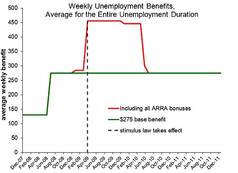
The green line in the chart below shows the average weekly benefit received by unemployed people over time, assuming that:

(a) they were receiving $275 a week until their benefits were exhausted
(b) about half of the aggregate time unemployed occurs in the first 26 weeks
(c) essentially all unemployment spells end in less than 99 weeks

These assumptions are a close approximation to the unemployment spells experienced by people 25 to 64 during 2010. For the reasons explained above, the line jumps to $275 from $138 in mid-2008, and then is constant thereafter.

However, the eligibility period is not the only part of the unemployment insurance rules that have changed since the recession began. The American Reinvestment and Recovery Act (the “stimulus law”) made a number of additional changes.

It increased the weekly benefit by $25 a week (and guaranteed that the $25 increase would not cause anyone to lose Medicaid coverage); federally funded 100 percent of extended benefits; exempted the first $2,400 of unemployment insurance received in 2009 from federal income tax; and paid 65 percent of an unemployed person’s health insurance premiums.

The act also paid states about $7 billion to allow more of the unemployed to qualify for benefits.

The federal financng of extended benefits meant that employers would not be liable for the extended benefits received by their former employees, which makes it less profitable for them to contest unemployment claims made by their former employees.

A $25 weekly benefit bonus was clearly worth $25 a week for as long as it lasted (until mid-2010). At a marginal federal income tax rate of 21 percent, the exemption from federal income tax on the first $2,400 of unemployment insurance received in 2009 is worth about another $10 a week.

Perhaps the most valuable added benefit was the health insurance subsidy. For unemployed people who, through the Cobra program, continued to participate in the health insurance plan they had with their former employer, the federal government would pay 65 percent of the premium. For such people, this subsidy is estimated to be worth about $170 weekly. This benefit ended in mid-2010.

The red line in the chart shows the combined unemployment benefits for an unemployed person participating in the Cobra program, excluding any benefits received from other safety-net programs such as food stamps or Medicaid.

The weekly benefit peaks in 2009 at $455. The increase in early 2009 when the stimulus law passed is even greater than the increase in mid-2008 from the lengthening of the eligibility period.

It is not yet known how many unemployed people received the Cobra health insurance subsidy, but many who did not had their health insurance covered by another federal program, Medicaid.

Moreover, a $455 weekly benefit is not small change; it is much more than someone would earn on a full-time job that paid minimum wage. Among the 106 million working-age heads of households and their spouses lucky enough to be working in 2009, about 25 million of them were earning less than $455 a week.

Even though Congress has not yet let emergency unemployment benefits expire, the largest unemployment benefit cut may have already occurred in 2010 when the stimulus law expired.

Article source: http://feeds.nytimes.com/click.phdo?i=72a45d6b308aa15dd9c036900e14dd57