 Jed Jacobsohn for The New York TimesSam Mogannam plans to make some changes.
Site Analysis
What’s wrong with this Web site?
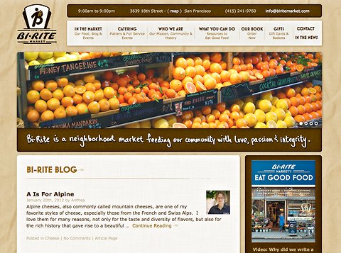
In last week’s post, we featured the Web site of Bi-Rite Market, an extremely popular San Francisco grocery. One year ago, Sam Mogannam, the market’s owner, redesigned the site and upgraded its social media efforts as part of an overall branding program. Mr. Mogannam reported that he believed the redesign of the site — which promotes the store but does not sell products online — resulted in a steep increase in visitors to the site and a 20 percent increase in the store’s sales.
We asked readers to take a look at the site and at Bi-Rite’s social media efforts. Here’s what you had to say, along with my take and Mr. Mogannam’s response.
A good home page, I believe, should act as a gateway to all of the information on a site. It should offer a core business message — what makes you different from and better than your competition — and then provide easy navigation to pages that address specific interests or needs. Readers felt the Bi-Rite homepage did not do a great job of accomplishing this. The big problem, they said, is that the Bi-Rite blog is too dominant on the home page.

“A blog on the home page is kind of weird,” wrote artalacarte from Connecticut. “A home page should be a quick introduction to the whole Web site. Who you are, what you do, what you can do for ME …”
PW from Texas agreed: “The home page doesn’t make me want to go much further because it doesn’t make me hungry. Blogs and Twitter posts are great additions to a Web site but I don’t expect them to be their main features.”
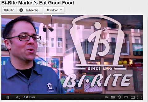
What might replace the blog on the home page? Several readers mentioned a video produced by the Bi-Rite team that is professional, entertaining and informative — but buried in a link on the bottom right side of the home page. In the video, Mr. Mogannam speaks passionately about food and Bi-Rite’s commitment to service.
“I love the video about the market that’s attached to the Bi-Rite Book,” wrote Eric Marcus from New York. “Glad I clicked on it because it’s terrific! Now I can’t wait to visit the store the next time I’m in San Francisco. If it were my site, I’d put that video front and center.”

Readers were also hungry for more photographs of the food. “Too much to read and not enough to look at,” wrote PW. “If you want to catch the attention and interest of your visitors, you should focus more on visual appeal. You can portray your commitment to your community with pictures as much as with words.”
Several readers pointed out how well the site presented critical information. “Hours and contact info are posted prominently on each page,” wrote Julie B. from McHenry, Ill. “So simple, yet so important! Nothing worse than hunting around on a small-business Web site for 10 minutes just to find out if they’re open.” But readers also noted that there are several typos in the copy, something they felt made the site look unprofessional.
For a market that does a good job of engaging visitors to its store, readers felt that it could do a better job engaging visitors online. “The site, and the Facebook page, which I looked at, are very one-way,” wrote Friend from New England. “The Web experience could be much more interactive and create a community atmosphere online to complement what it seems happens at the store. Maybe Facebook is the best place to do this so people don’t have to make a special visit to the store page. I think Bi-Rite could do a lot more to involve customers. ASK about what they buy, what they cook, what they want to buy, where they eat, etc.”
Friend used the example of Georgetown Cupcake as a company that does an excellent job of interacting with customers on its Facebook page. A great way to create user interaction is to have visitors provide user-generated content. “I feel that there is room here for a greater store-home connection,” Jen from New York wrote. “They have some recipes on the blog. Why not list the ingredients, perhaps even by store location/aisle? Make it easy for a consumer to print out the recipe, and to find, buy, bring home, use the items for a special dish.”
My Take
While I agree with many of the reader criticisms, I also want to say “Bravo!” to Mr. Mogannam and his team. This is a business that takes its online presence and marketing seriously, and it has paid off. Bi-Rite made a relatively small investment and increased both its site traffic and the store’s sales. In all likelihood, the store recouped its investment almost immediately.
That said, there are plenty of ways the site can still be improved, and I agree with the readers on its main flaws. I think it’s a mistake to let the blog dominate the home page. It’s great to have a blog, of course, especially one that is informative and well written, but it should be a secondary feature. Let visitors know you have a blog, tease them with a small amount of content, and then get them to click onto the blog page if they’re interested in reading more. I also agree with the comments about the video, which gives a real feel for the market’s culture. It should be prominently displayed on the home page; in fact, it should be the centerpiece.
The points made about recipes and engaging the audience were also on the mark. Get your customers sharing recipes with each other. This not only builds community, it gives visitors reason to come back to your store and to your site. This kind of “stickiness” goes a long way to enhancing your brand.
Finally, while Mr. Mogannam has chosen not to be a full-service e-commerce site, there might be more things he could be doing online to improve sales and customer relations. It might be great for business, for example, if you could place an order online either for pick-up or delivery. This might also work for the catering services.
Sam Mogannam Responds
Mr. Mogannam said he agreed with some comments but not with others. His biggest disagreement was about the placement of the blog on the home page. “Our blog posts are most demonstrative of who we are,” he said. “They tell the deeper story behind our food and the people who produce it. Nothing we’d rather have our audience see than that — assuming the nitty gritty info like store location, hours, etc. are easy to find — which the comments indicate they are.”
Mr. Mogannam said that the most helpful advice was to offer more images and less writing. “We’ve heard it once, we’ve heard it a million times,” he said, “that people don’t have the patience to read much these days, and a picture says a thousand words. As interesting as we think a story about cheese making or teaching kids to plant their own food is, it will be lost if not shown through images to accompany the written word.”
Mr. Mogannam said he is taking many of the suggestions to heart and will make a number of changes, including:
- Working on promoting more social media interaction, engaging the audience in conversation.
- Putting video front and center.
- Adding more photos of food to the recipe, catering, and deli pages.
- Using spell check “religiously”
Would you like to have your business’s Web site or mobile app reviewed? This is an opportunity for companies looking for an honest (and free) appraisal of their online presence and marketing efforts.
To be considered, please tell me about your experiences — why you started your site, what works, what doesn’t, and why you would like to have the site reviewed — in an e-mail to youretheboss@bluefountainmedia.com.
Gabriel Shaoolian is the founder and chief executive of Blue Fountain Media, a Web design, development and marketing company based in New York.
Article source: http://feeds.nytimes.com/click.phdo?i=b753c365d59d95844d7522978bd03d31